Product Design
Microsoft Exposure Management
Microsoft Exposure Management provides security teams end-to-end visibility of their organization’s security posture. It’s designed to give teams focus on key areas they should protect, reduce risk, and manage exposure.

Challenges
Confidently answering the question, “am I secure against X?” has become challenging to security teams. The UX approach for Exposure Management as whole was how to tackle a new concept of protection that puts focus first while keeping a simple at-a-glance posture view. Educating customers on a new protection conceptualization was the main struggle. This idea came from the following struggles customers expressed:
Confidently answering the question, “am I secure against X?” has become challenging to security teams. The UX approach for Exposure Management as whole was how to tackle a new concept of protection that puts focus first while keeping a simple at-a-glance posture view. Educating customers on a new protection conceptualization was the main struggle. This idea came from the following struggles customers expressed:
Fragmented VisibilitySecurity teams are constrained by siloed, incomplete attack surface views and experiences
Posture FatigueData overload from the tools without meaningful context prevent proper prioritization
Reactive Approach Operational team inefficiencies resulted from lack of comprehensive and focused view and slow work processes

Main product goals
Approach
- Information architecture is key - the most important information is placed where it makes sense, so users can zip around the platform without getting lost when keeping in mind the product overarching goal: allowing for protection visibility while offering customers to take action and reduce their risk.
- Constant transparency - ther organization’s “how am I doing” status is consistenly reflected across all pillars in the clearest way.
- User research - the platform was released in a very initial ‘Beta’ version, allowing me to collect feedback from customers at every step on the way while calloborating with the user research team to further investigate topics like onboarding, navigation, and score reflection.
- Customization - while offering the customers the idea that Microsoft knows best in terms of how to protect, it was also important for me to allow them to prioritize on their own, giving the essence that they know what’s best for their organization.
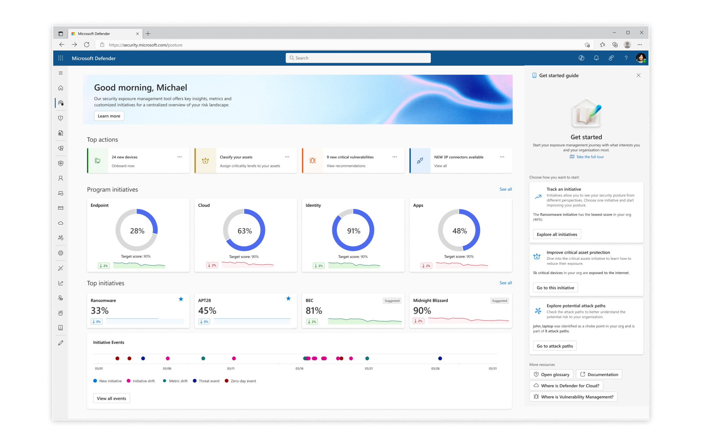
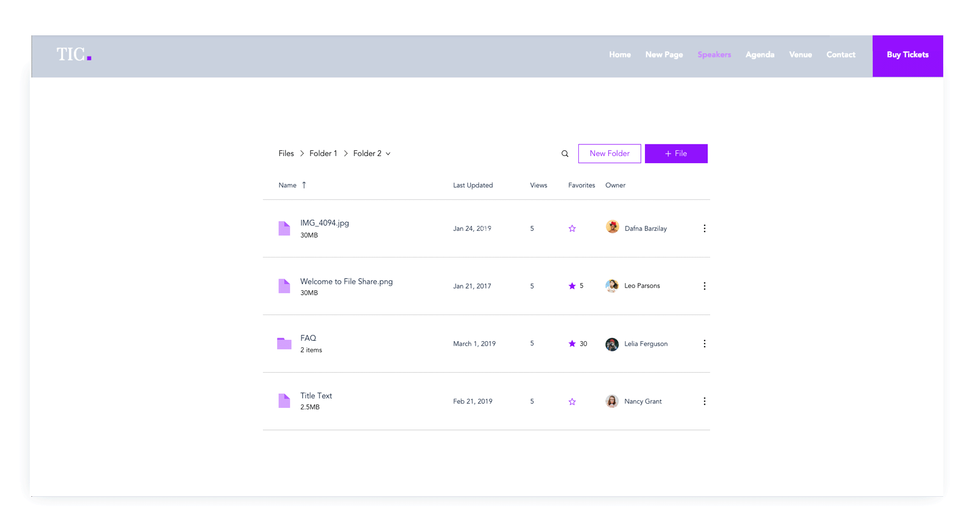
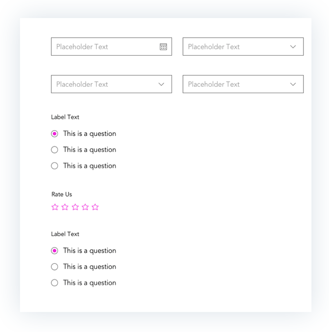
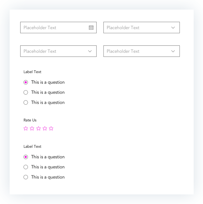
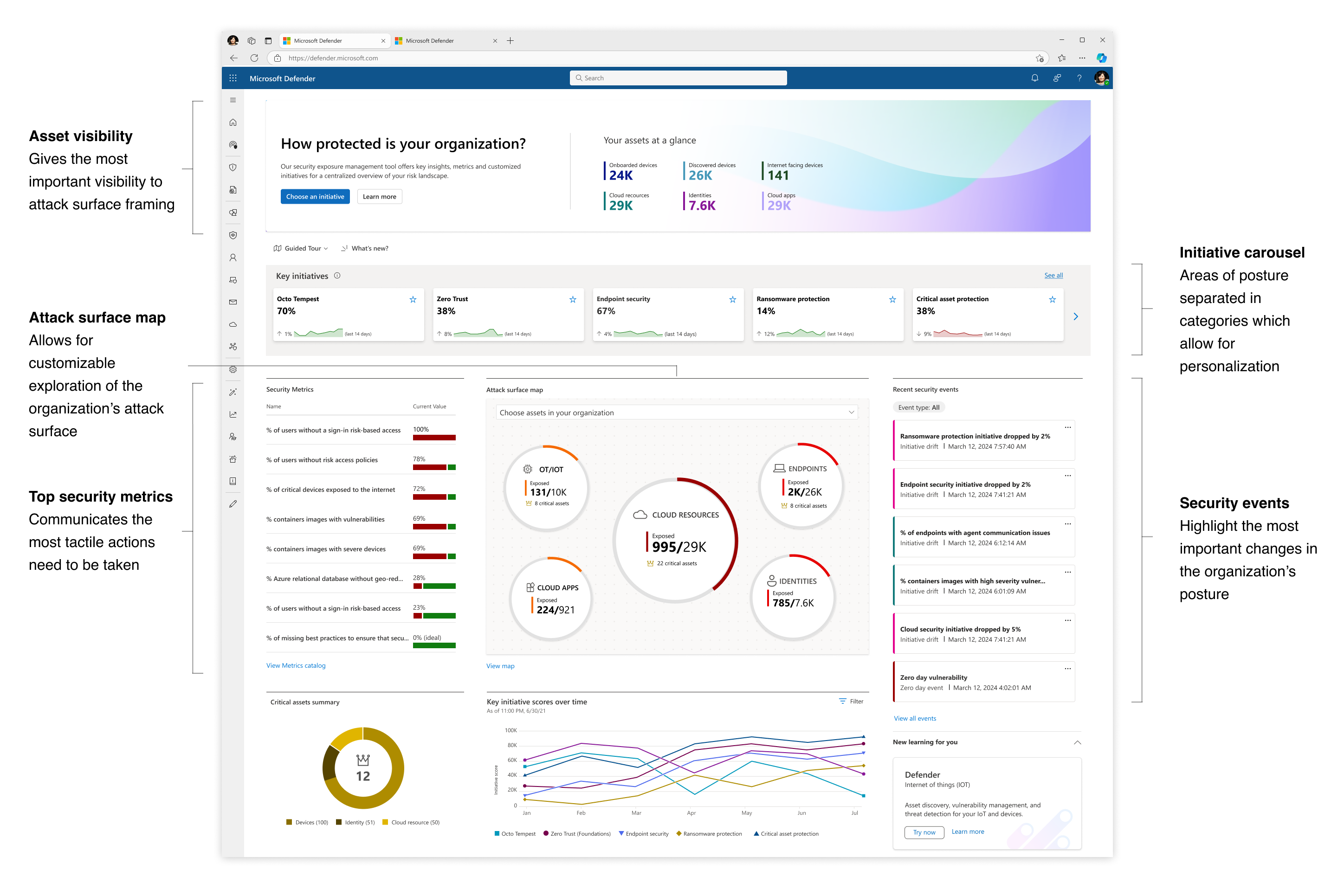 The initial Exposure Management dashboard released in Beta version
A new protection model: Exposure Management introduced new concepts into the posture framework, a challenge in itself to introduce to new customers:
︎ Initiative
A project or action plan addressing exposure and posture-related objectives in main areas of security organizations.
Examples:
Ransomware
Endpoint Security
Zero Trust
Examples:
Ransomware
Endpoint Security
Zero Trust
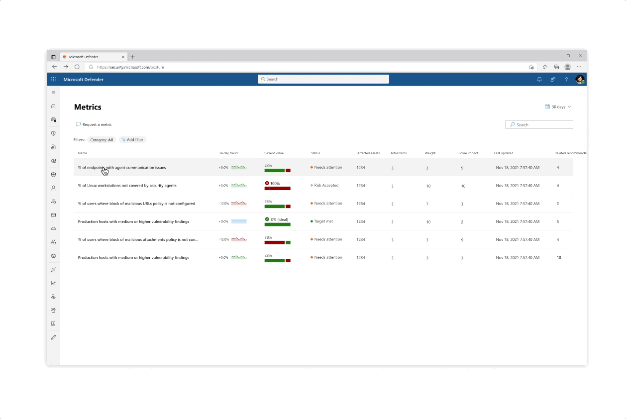
︎ MetricA measurement of a security-related process with an insight into the exposure status of the organization around a given topic.
Examples:
% of critical vulnerabilities
# of admin users without MFA enabled
% of servers running an unhealthy agent
Examples:
% of critical vulnerabilities
# of admin users without MFA enabled
% of servers running an unhealthy agent
︎ RecommendationA recommended action security practitioners can perform to address security gaps and improve Metrics status.
Examples:
Enable cloud-delivered protection
Turn on Microsoft Defender Antivirus
Require multi-factor authentication
Examples:
Enable cloud-delivered protection
Turn on Microsoft Defender Antivirus
Require multi-factor authentication

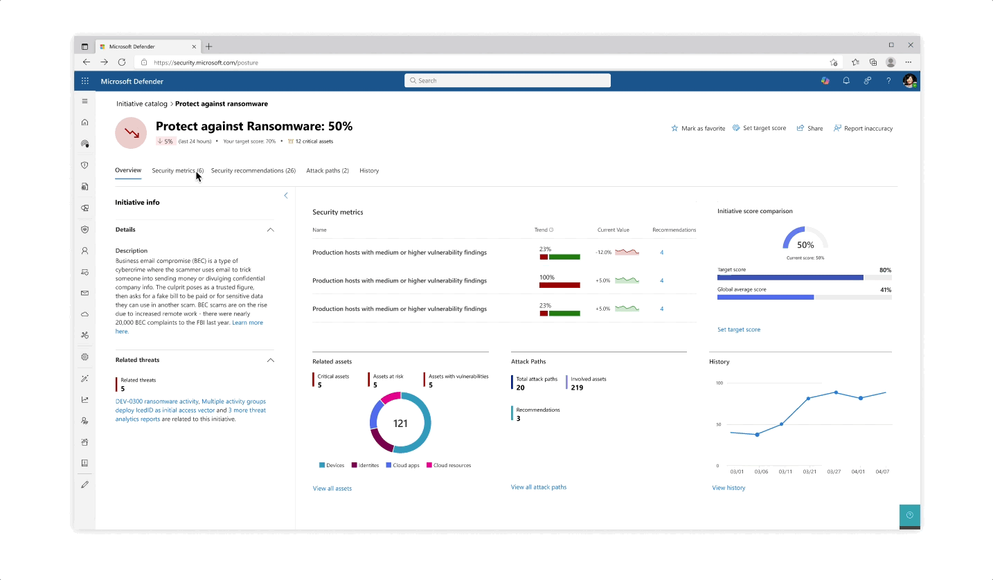
Design for the initiative and metric catalogs, as well as the initiative page
Challenge: Giving customers the right amount of focus
- The experience behind each initiative whether it’s reflected in the catalog or in the page is that the most important data is always prioritized, yet a focused deep dive of actions can be tajeb in inner click-throughs which are always linked back together to get the main area of focus
- Inner tabs at every step of the experience whether it’s in a side panel or page allow for bigger analysis of protective actions
- The initiative page gives an aggregated view of protective analysis with a focus on score at every step of the page
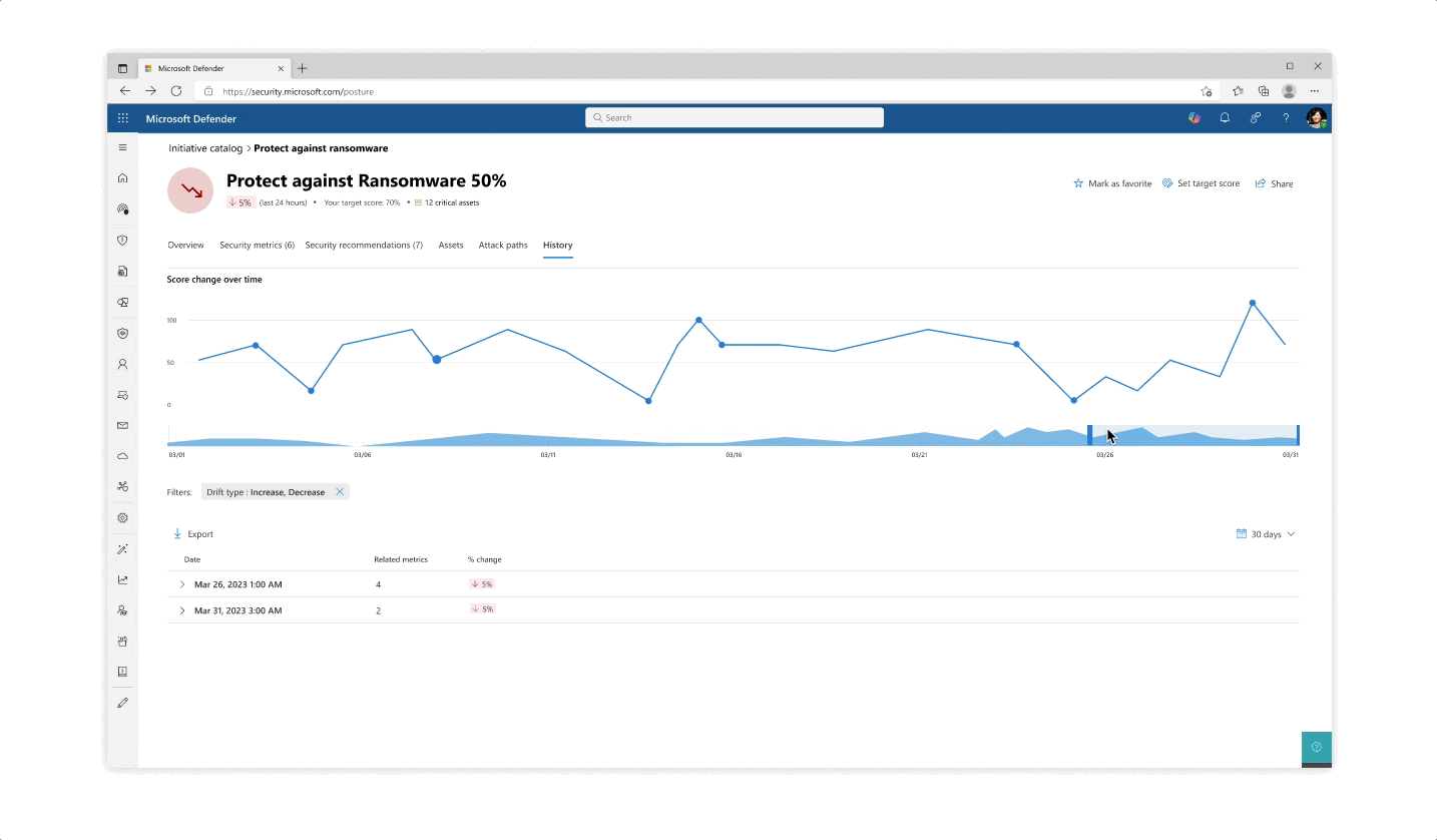
Challenge: understanding your score
- The various pill protection scores were obligatory to reflect as they communicate the organization’s posture status at every step of the way
- Beyond the score’s reflection, a main interest of users was why a specific score dropped and what possible actions they would take. The history tab of an initiative was designed so that users can get an holistic historical view but could also zoom in on specific areas and understand the reasoning behind changes.
- Another challenge that became evident is communicating the various metrics’ scores besides their customized target scores (as not every user wanted to put the same amount of work and focus into each pillar of protection).
 Design explorations for metric score representations
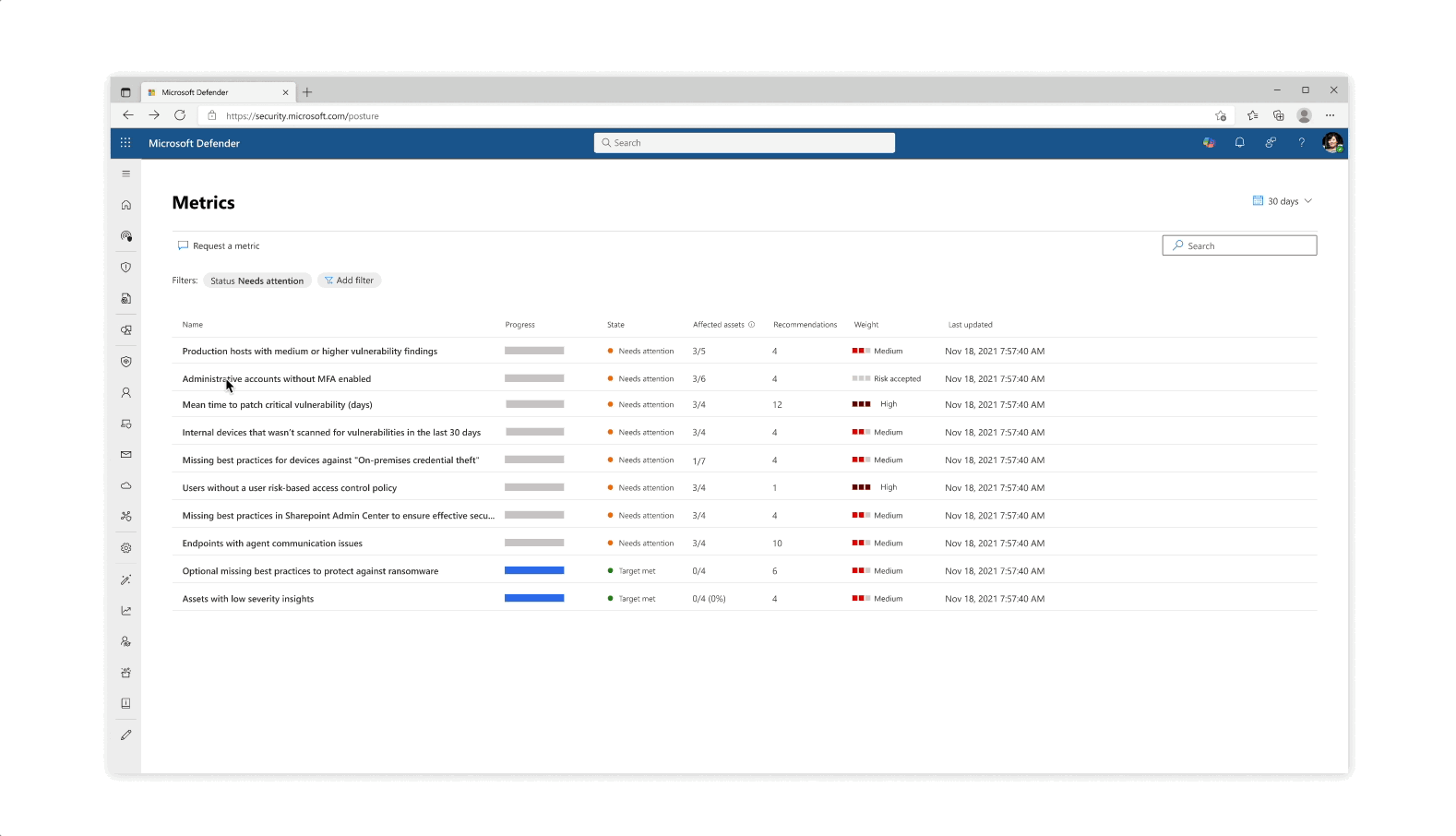
Solution: Trackable progress
- From confusing exposure scores, the approach was changed to make for trackable metrics, leaning in to more actionability across the product
- The metrics became a worktable tracking tool that allowed for analysts and team leaders to get a clearer protection state across specific and focused domains
Impact & Results
- I collected feedback from customer calls and user research in the ‘Beta’ version which kicked off a re-design for the new product dashboard that includes a more holistic tool for onboarding, immediate recommended actions, improvement of events design, and more focus on exposure.
- 80% of large customer tenants engaged with Microsoft Exposure Managements. 65% of all tenants actively participated
- New scoring UX showed 51% favoring new solution vs 42% of beta version in A/B testing
- Watch a full demonstration of the product (and don’t forget to look at the beloved comments!):
Product Design
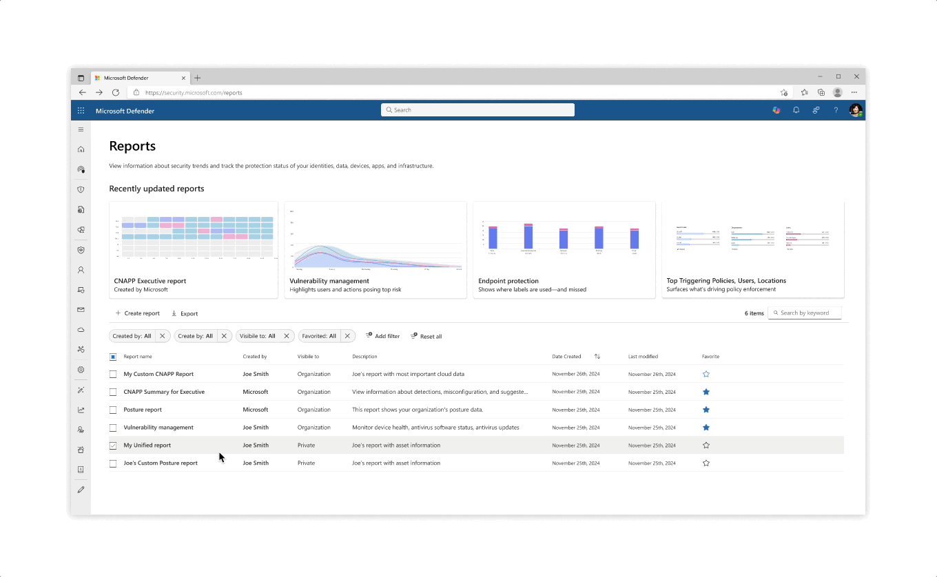
Microsoft Defender Reports
Microsoft Defender reports enable security teams to view information about detected threats, device status, and more. However, the existing reports in Defender were too static and not customizable enough to meet the unique needs of each customer.

The Problem
User Research across multiple Microsoft security products shows that reporting experiences are often static, difficult to customize, and inconsistent with user expectations. Customers need more flexible, discoverable, and role-relevant reporting tools to effectively meet their organizational requirements.
User Research across multiple Microsoft security products shows that reporting experiences are often static, difficult to customize, and inconsistent with user expectations. Customers need more flexible, discoverable, and role-relevant reporting tools to effectively meet their organizational requirements.

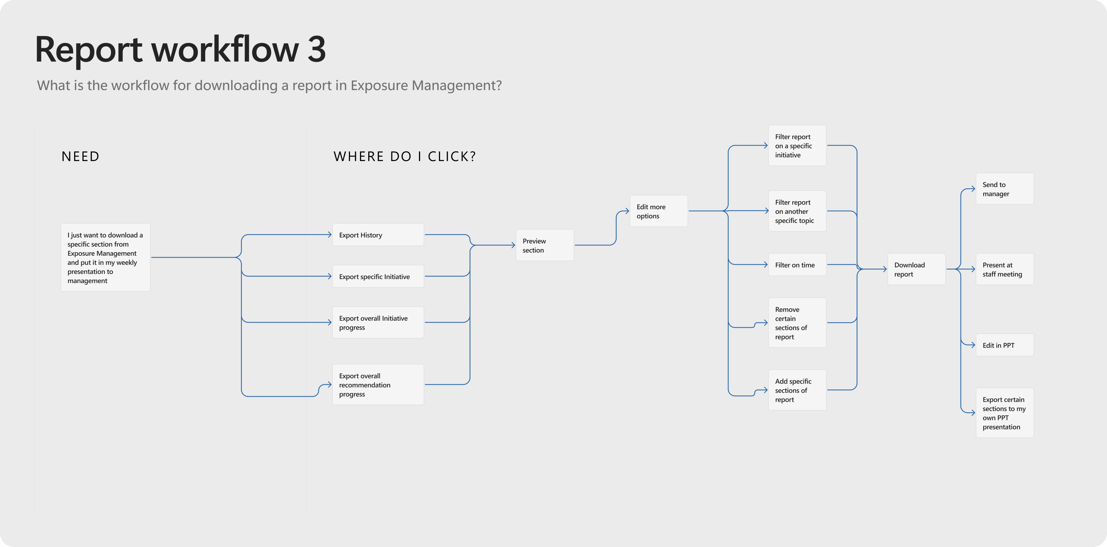

User journey options mapped out for report work flows
The Process
- User Research Collection: I gathered insights from interviews, surveys, and existing data to understand user needs, behaviors, and reporting challenges.
-
User Journey Mapping: I visualized the end-to-end reporting experience to identify pain points, opportunities, and moments that matter most to users when consuming reports.
-
Competitor Analysis: I evaluated how other tools and platforms approach reporting to uncover best practices and areas for differentiation.
- Feasibility with VS Coding: I created a developed prototype of report behavior to understand engineering capabilities for customization
- User Testing: Once a re-design concept was establised, I validated reporting concepts and prototypes with real users to ensure usability, discoverability, and alignment with user expectations.
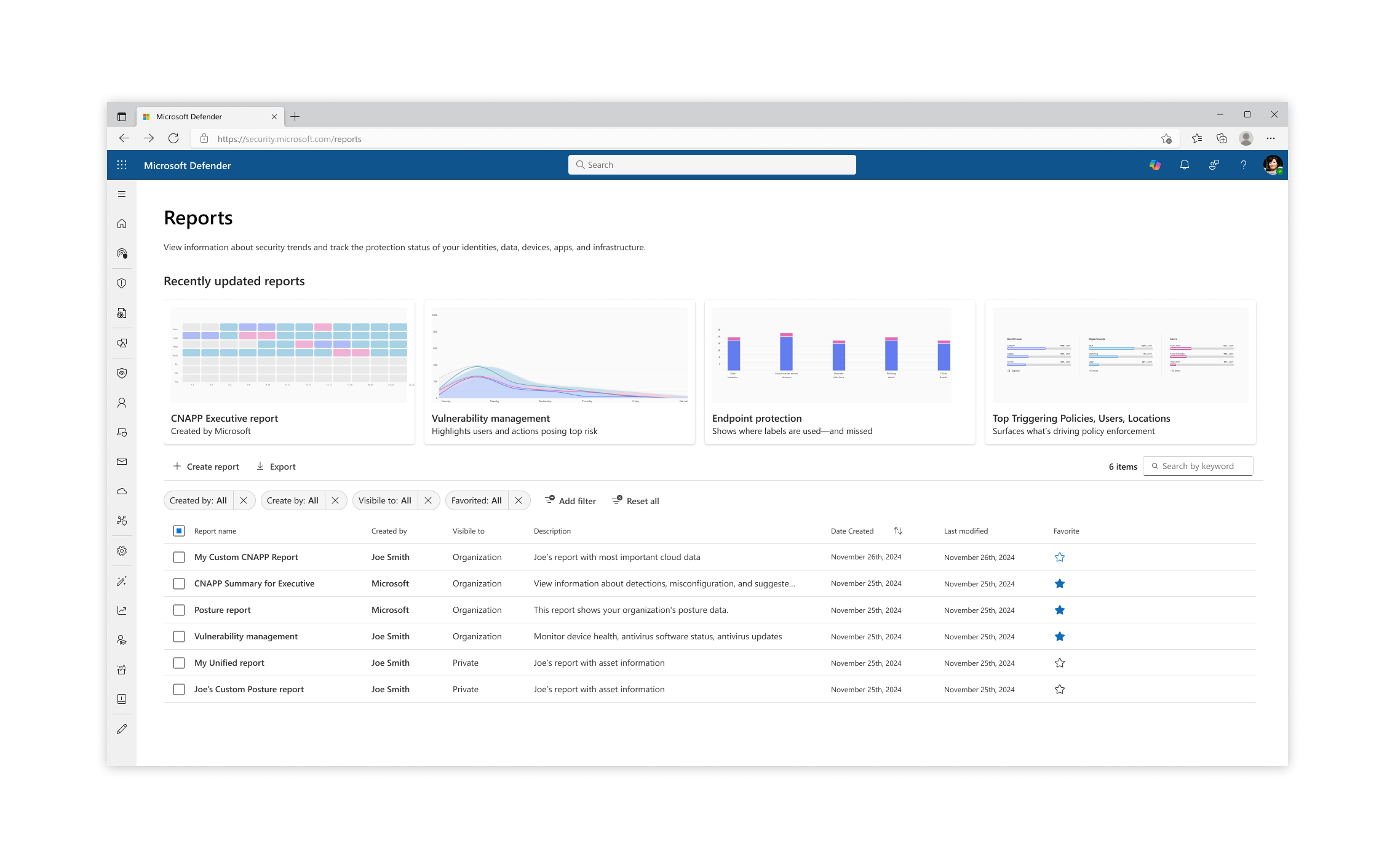
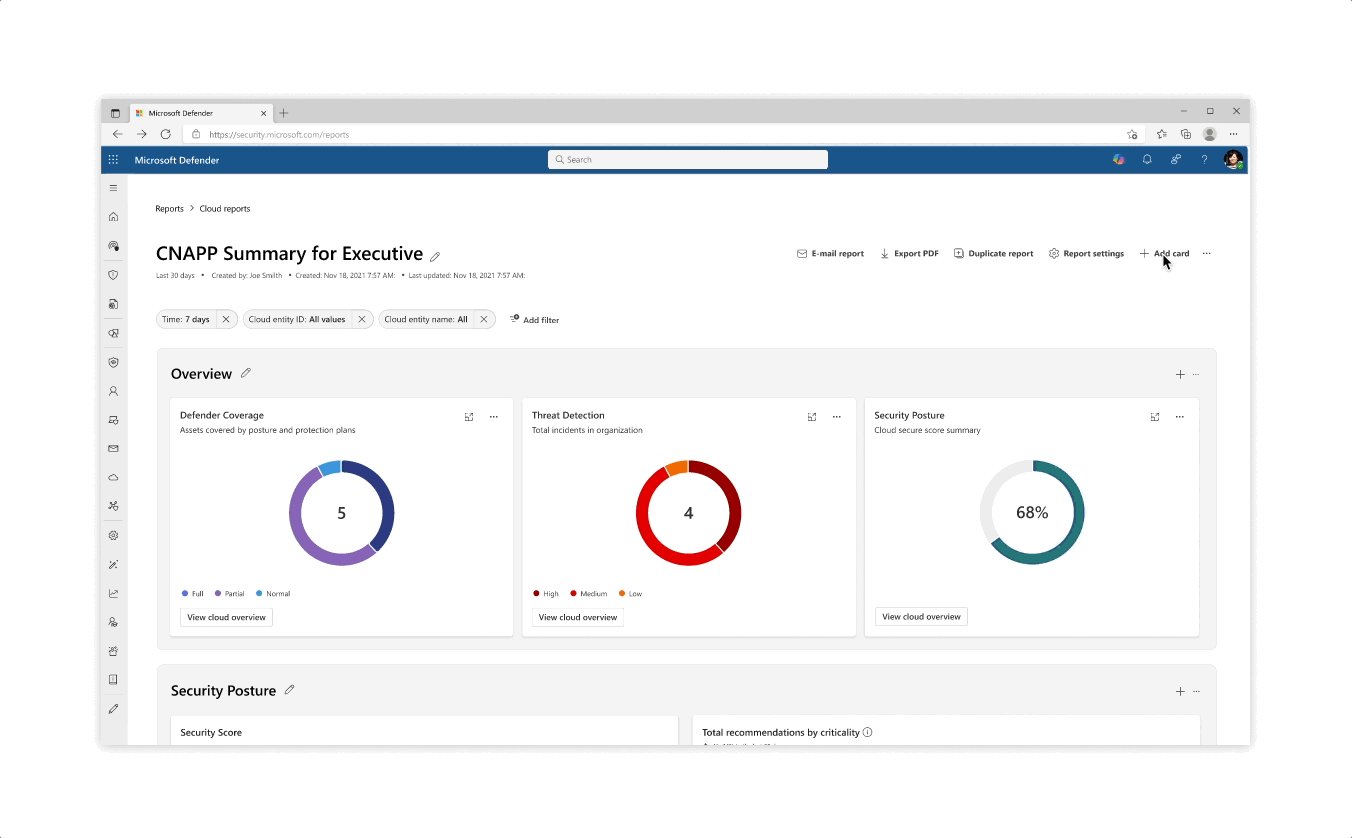
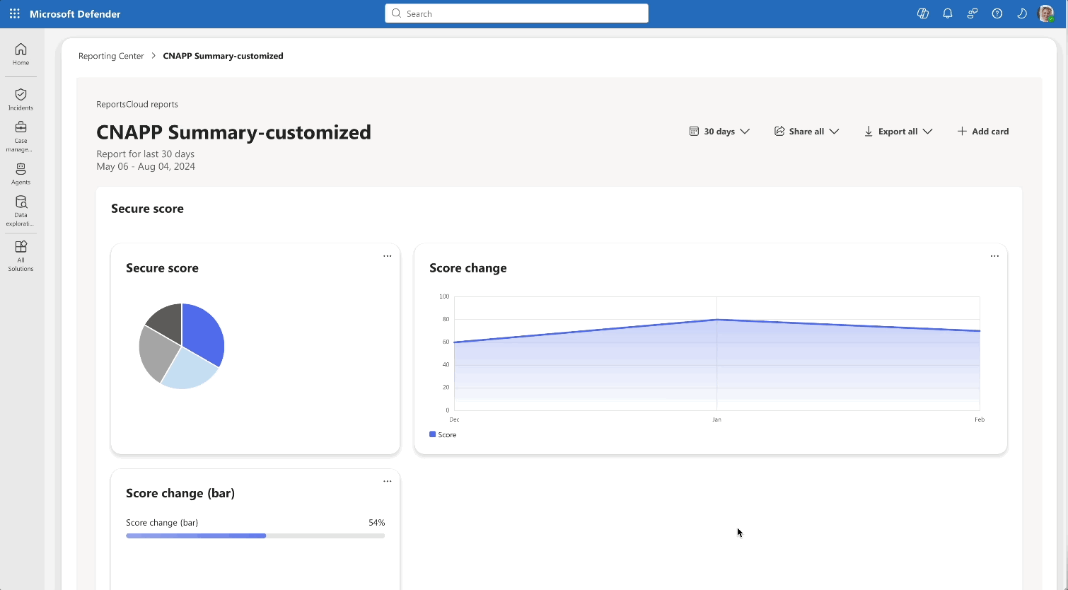
Re-design for the Reports catalog, which now included template reports created by Microsot as well as Custom User made
![]()
![]()
![]()
Flows & interactions for custom report create from scratch, report creation from template, and card creation
![]()
Developed prototype using VS Code

Flows & interactions for custom report create from scratch, report creation from template, and card creation
Developed prototype using VS Code
Challenges
- Clarity of Templates: Users struggle to understand the differences between Microsoft’s suggested template reports, making it difficult to choose the right starting point.
-
Customization Overload: The level of customization available can feel overwhelming, especially for users who just want to make quick edits or simple adjustments.
- Data Flexibility: Ensuring that data structures are flexible enough to seamlessly fit into predesigned cards or report components remains a key challenge.
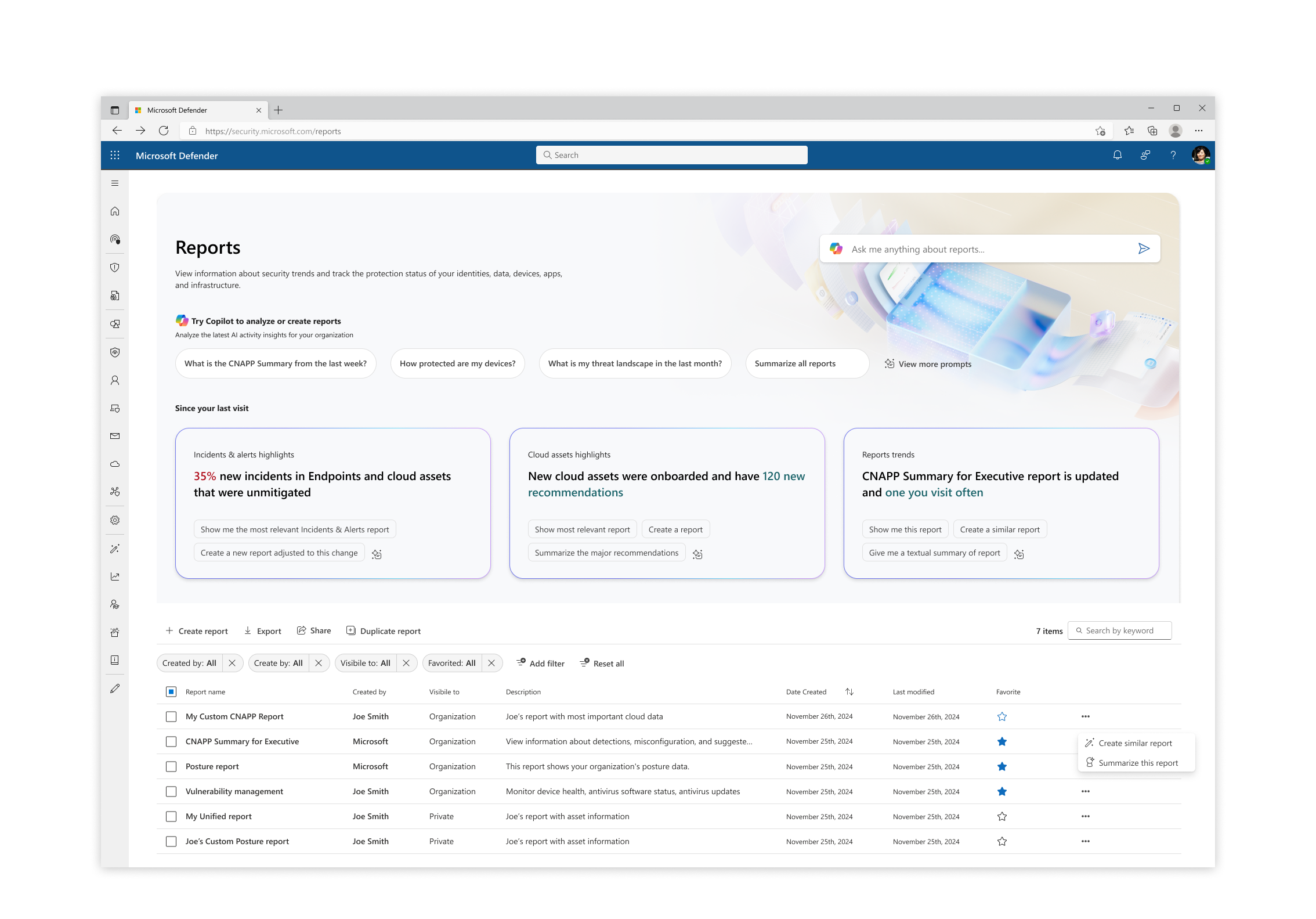

AI Integration
AI integration: The integration of Copilot introduces suggested prompts for report summaries, additional data, and general insights. These features guide users through the reporting process, making it easier to create meaningful and well-structured reports.
AI integration: The integration of Copilot introduces suggested prompts for report summaries, additional data, and general insights. These features guide users through the reporting process, making it easier to create meaningful and well-structured reports.

Takeaways
- Impact: Conducting user research provided a strong foundation to define an MVP that directly addressed customer pain points and guided improvements to the product experience.
-
Learning: More customization doesn’t always lead to happier users—striking the right balance between flexibility, simplicity, and helpful AI integrations is key.
- Improvement: I would focus on improving clarity in the reporting experience and highlighting the most important reports to help users find value faster.
Product Design
Wix File Share
Wix File Share is an application for Wix site owners with the goal of being the best tool for sharing files between site owners, members and groups. Users can create a file library so that their community members can easily share files with one another.
Audience
In collaboration with the feature’s Product Manager, I set out to find the target audience for the app’s social capabilities after its first launch. After a round of user interviews, we defined the main audience for this tool as online academies and communities, while keeping independent business owners as a secondary focal point.
In collaboration with the feature’s Product Manager, I set out to find the target audience for the app’s social capabilities after its first launch. After a round of user interviews, we defined the main audience for this tool as online academies and communities, while keeping independent business owners as a secondary focal point.
Defining the pain points
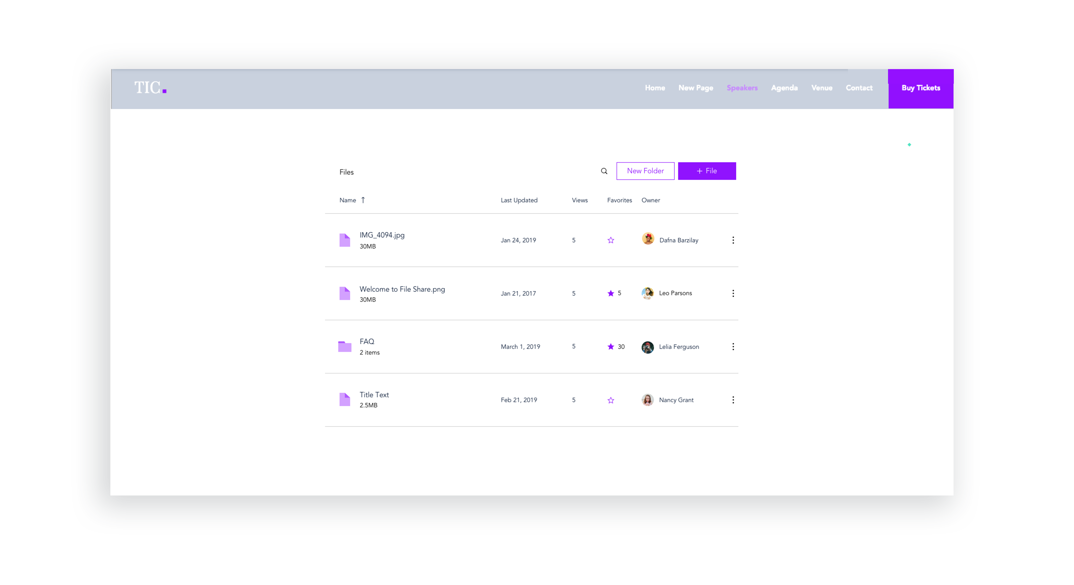
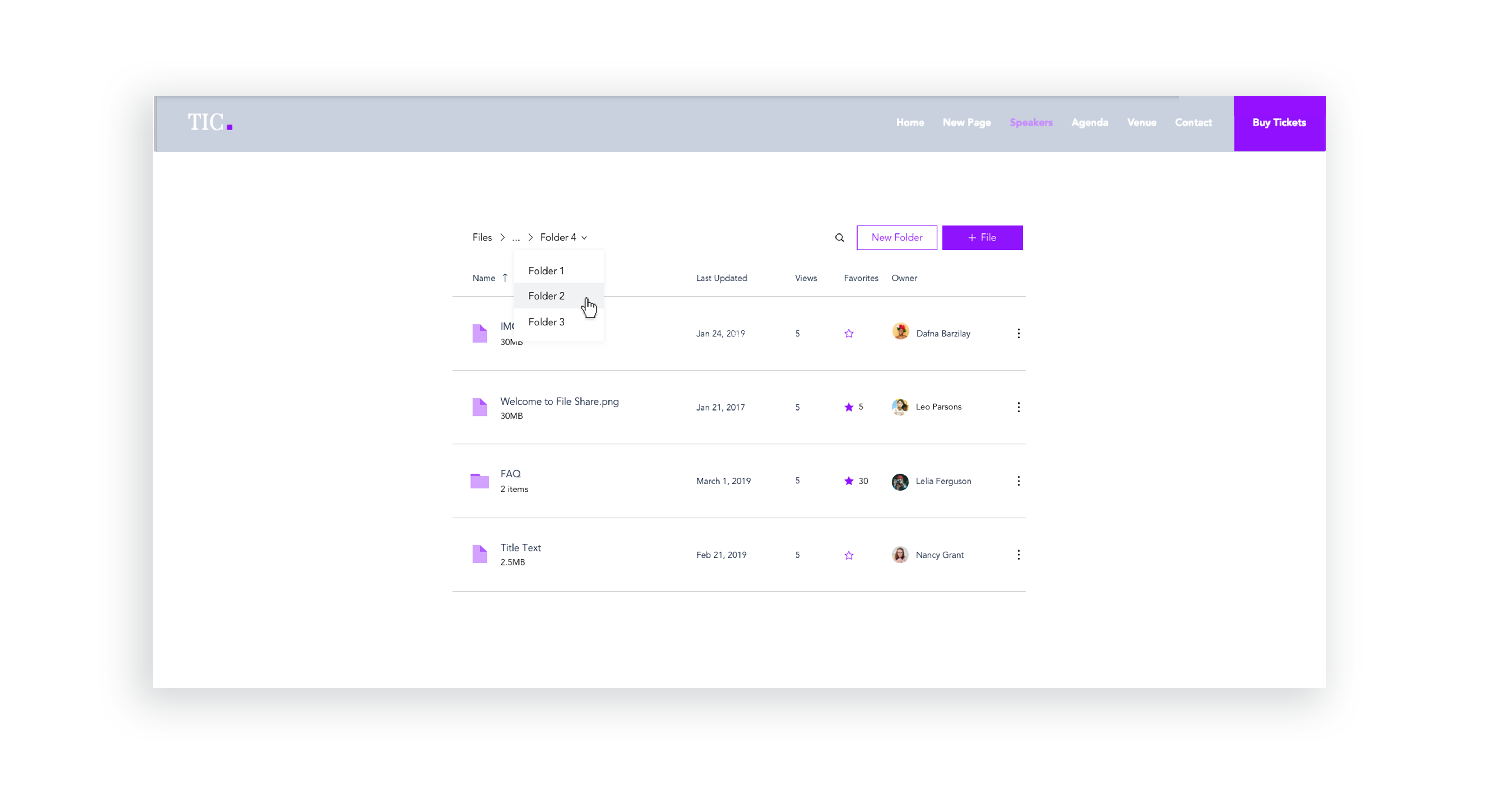
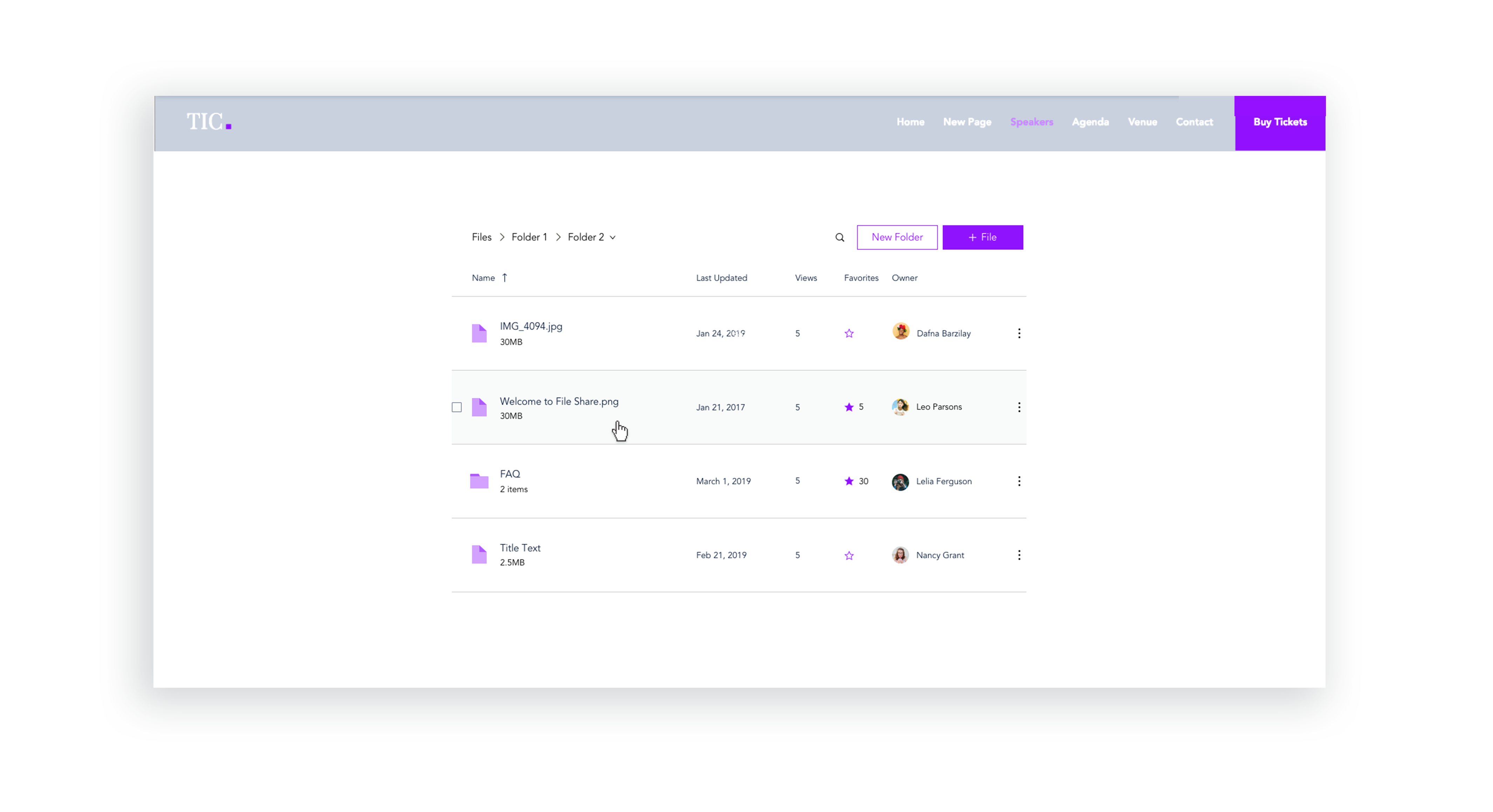
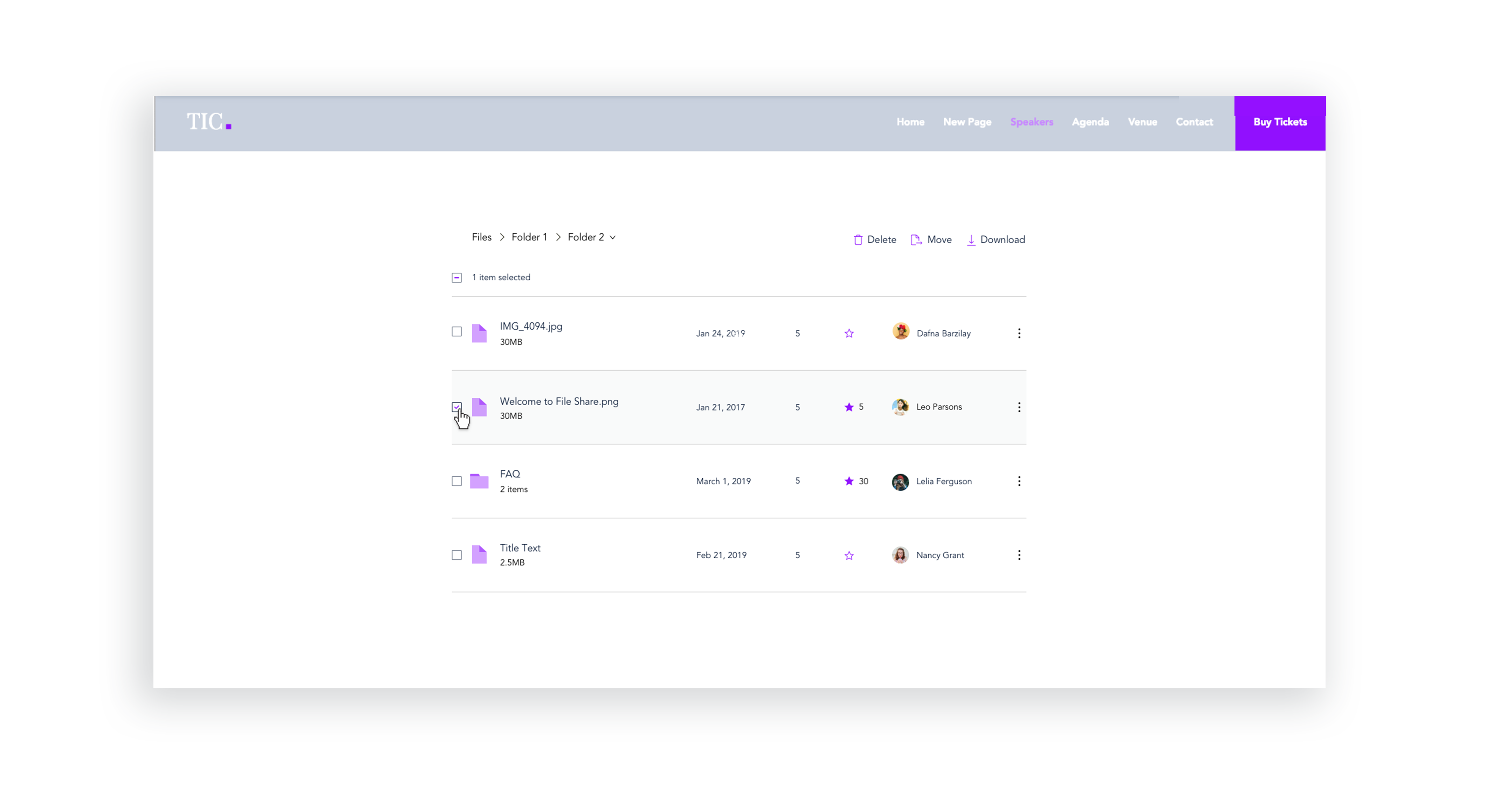
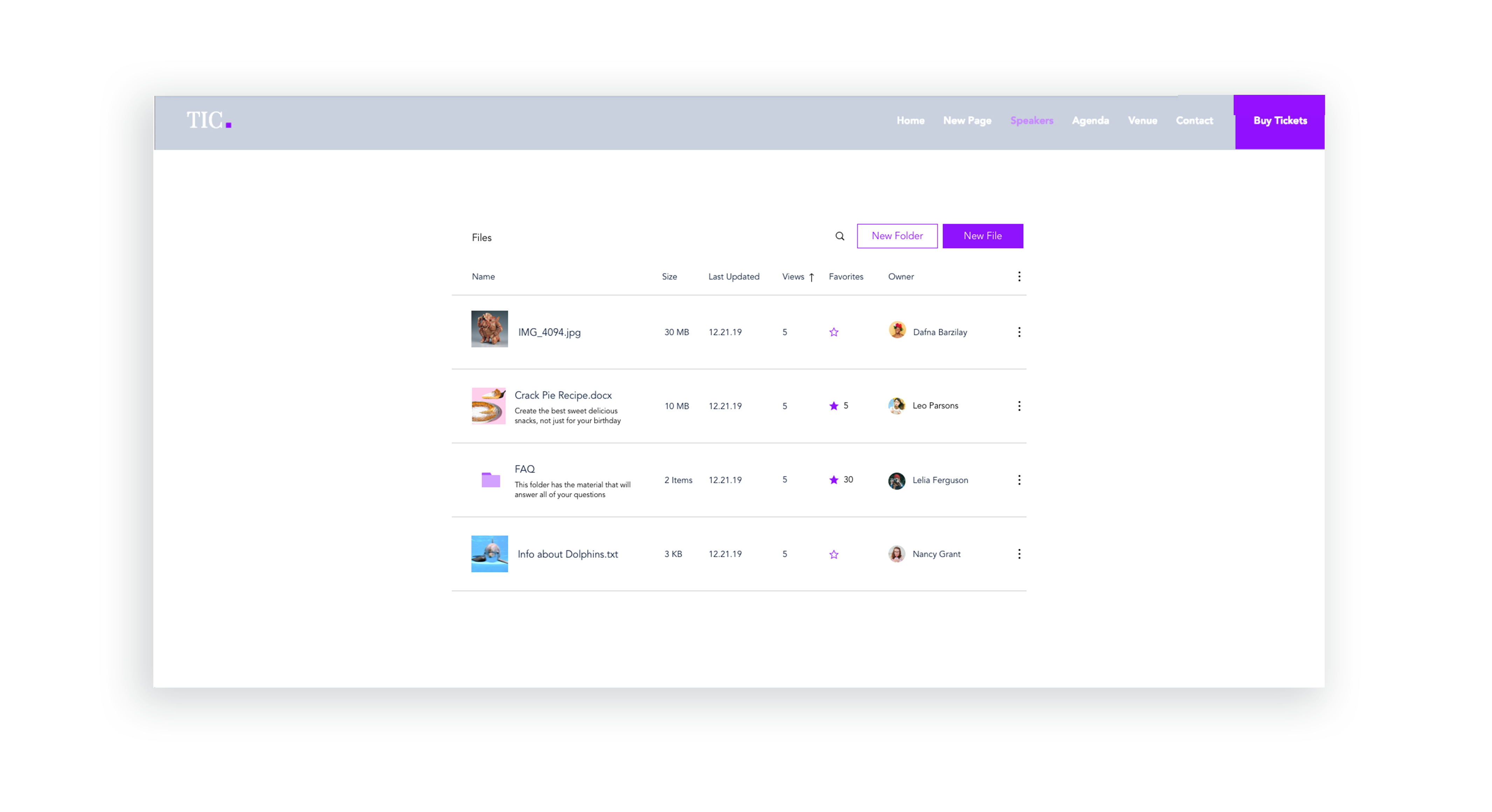
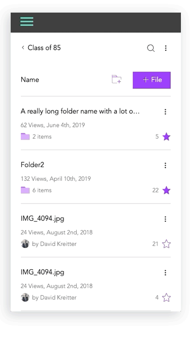
The app’s older design made it difficult to take actions on multiple files, navigate between folders, and easily distinguish between a file and a folder.
The app’s older design made it difficult to take actions on multiple files, navigate between folders, and easily distinguish between a file and a folder.
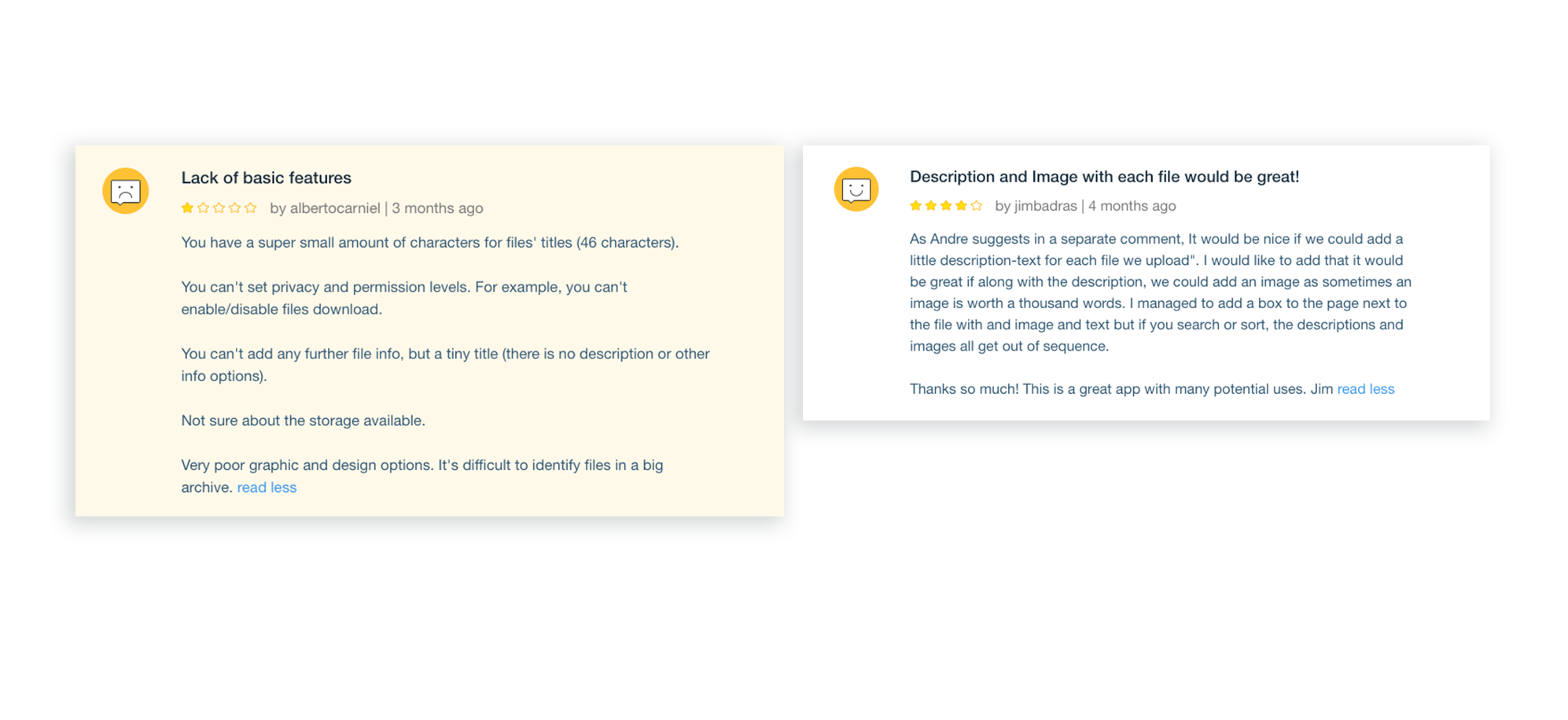
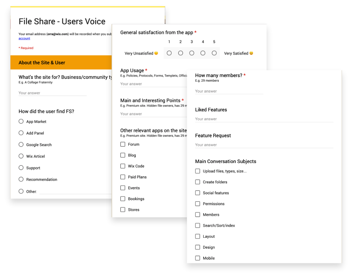
Besides the general usability issues that our own product team found to be problematic, we identified how our users customized and interacted with the product based on their utilization of the app in their websites. The next step was speaking to these same users and collecting app reviews:

Pain points
Based off of data collected from BI and user talks, the main pain points I defined were:
Based off of data collected from BI and user talks, the main pain points I defined were:
-
Basic UI capability improvements such as sort, search, and selection
-
Lack of image + description for files and folders
- Lack of privacy permissions for files or folders
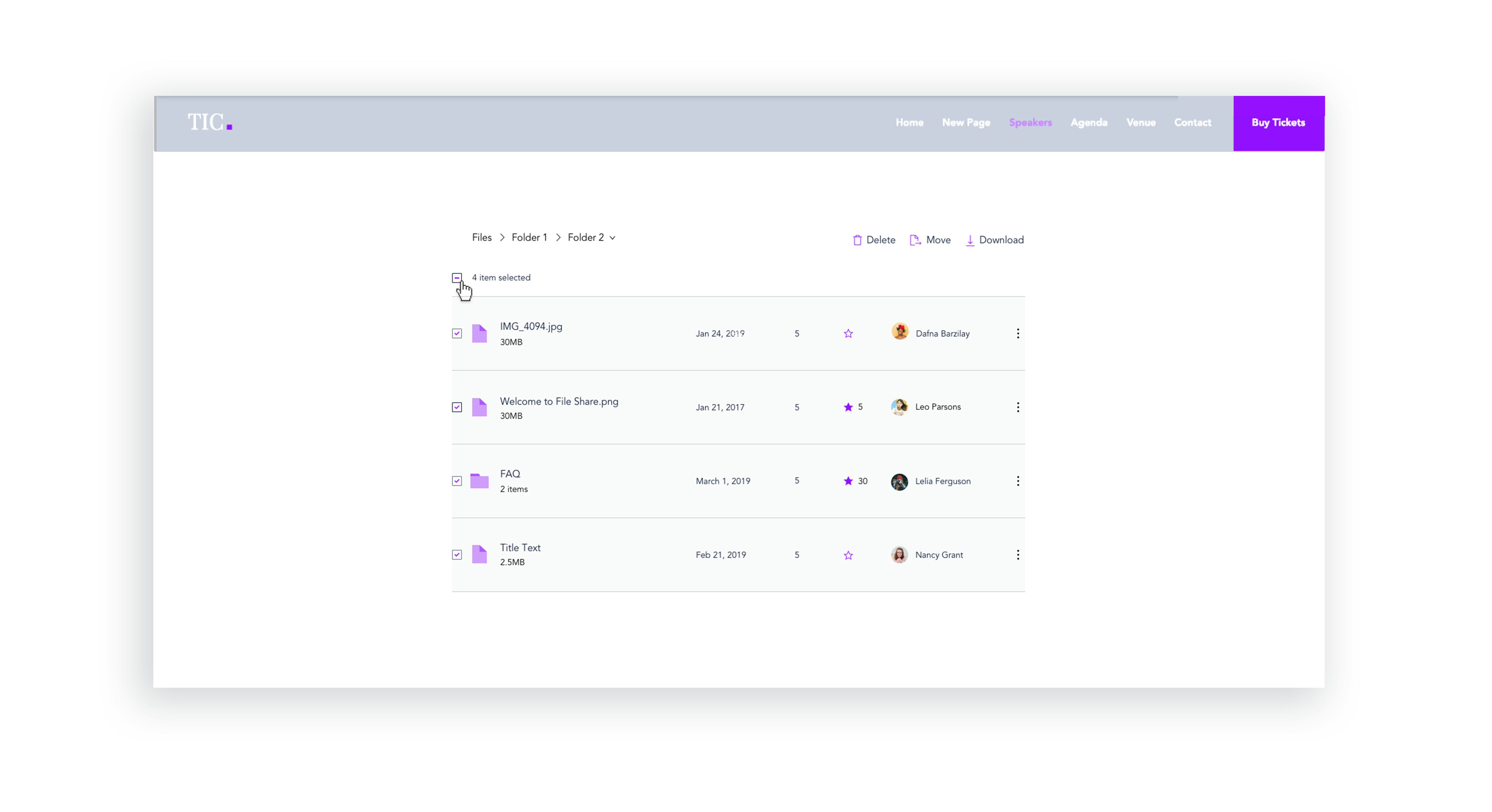
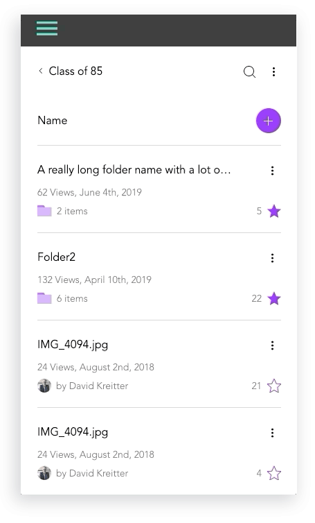
UI Improvements - Stage Design System integration
Issues like sort & search, selecting files, and navigating between folders were improved with the integration of the Stage Design System which I lead. Later, these changes were tested with usability studies on multiple participants.
Issues like sort & search, selecting files, and navigating between folders were improved with the integration of the Stage Design System which I lead. Later, these changes were tested with usability studies on multiple participants.
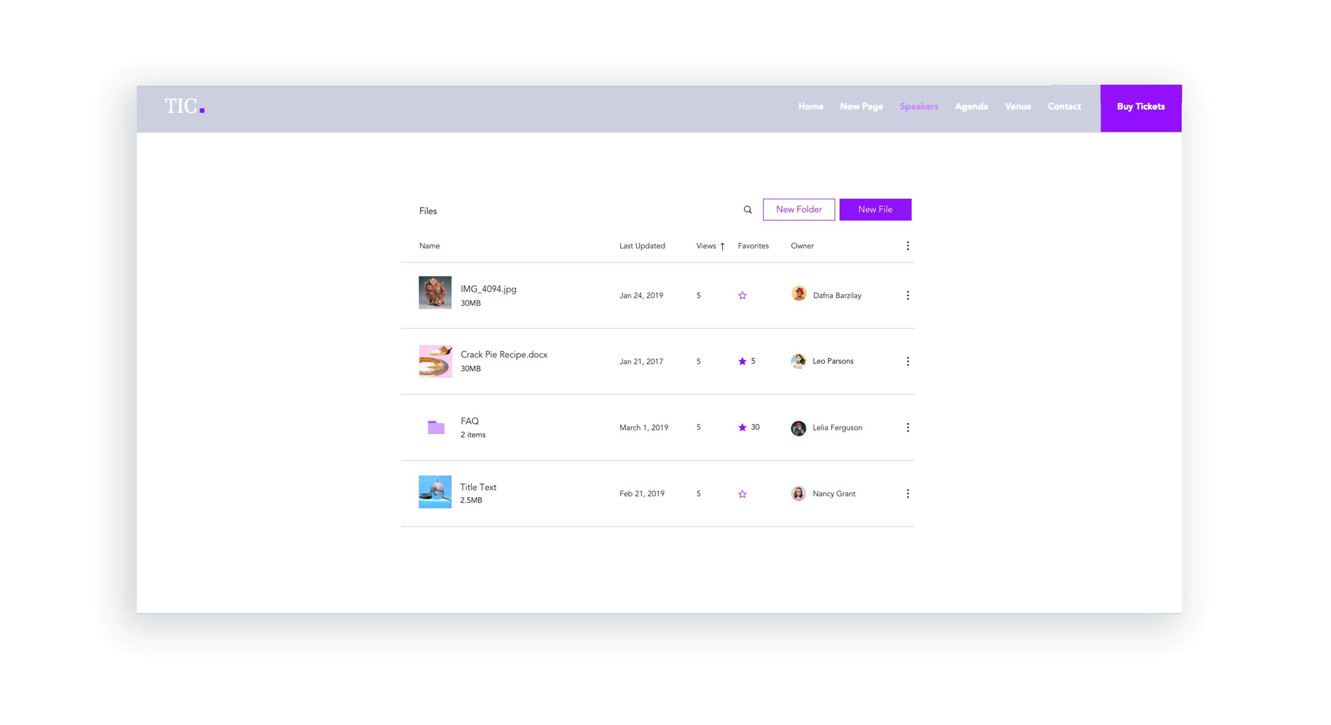
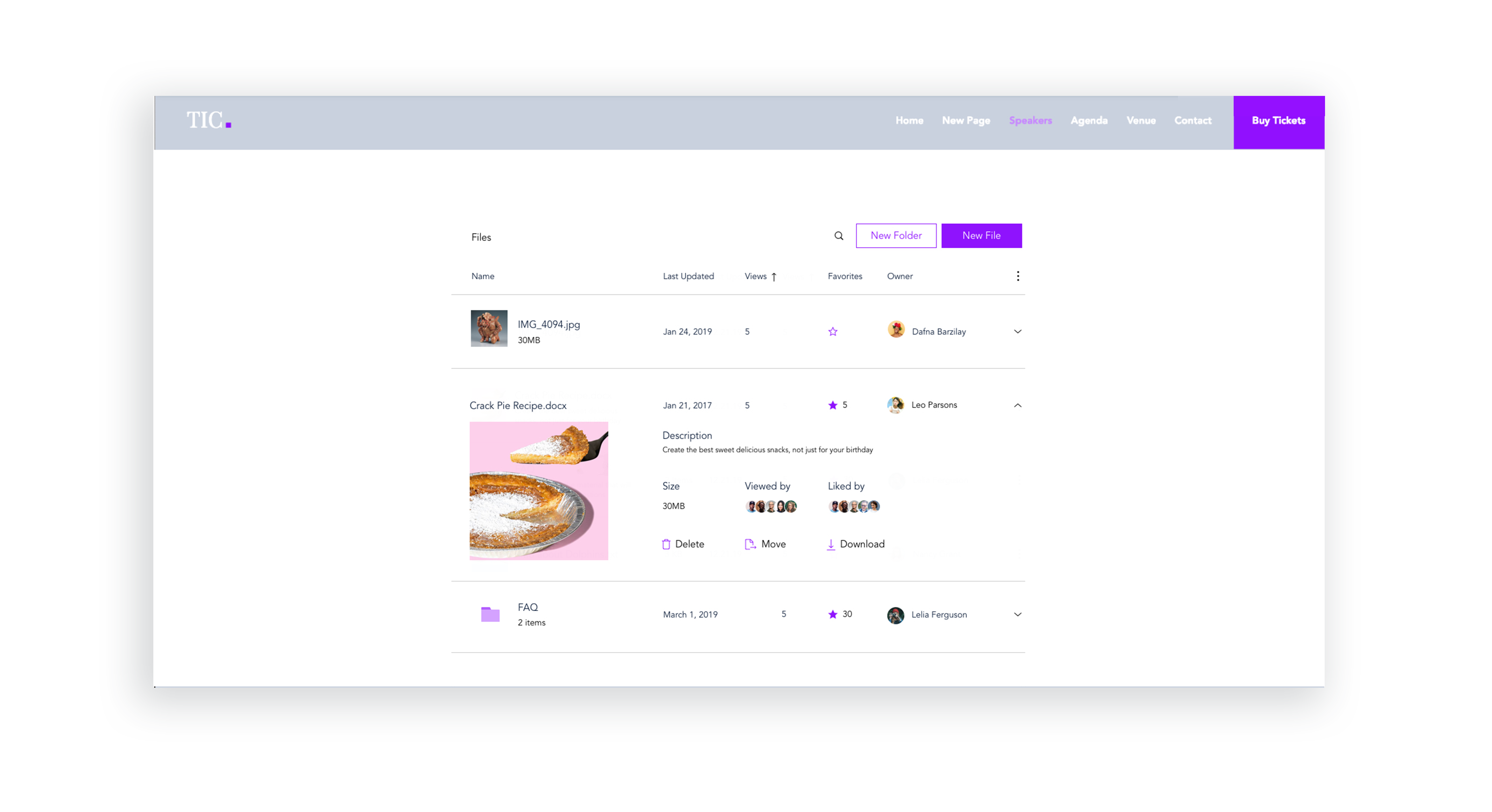
Lack of image + description for files and folders
I created initial layout sketches for files with images and description
I created initial layout sketches for files with images and description
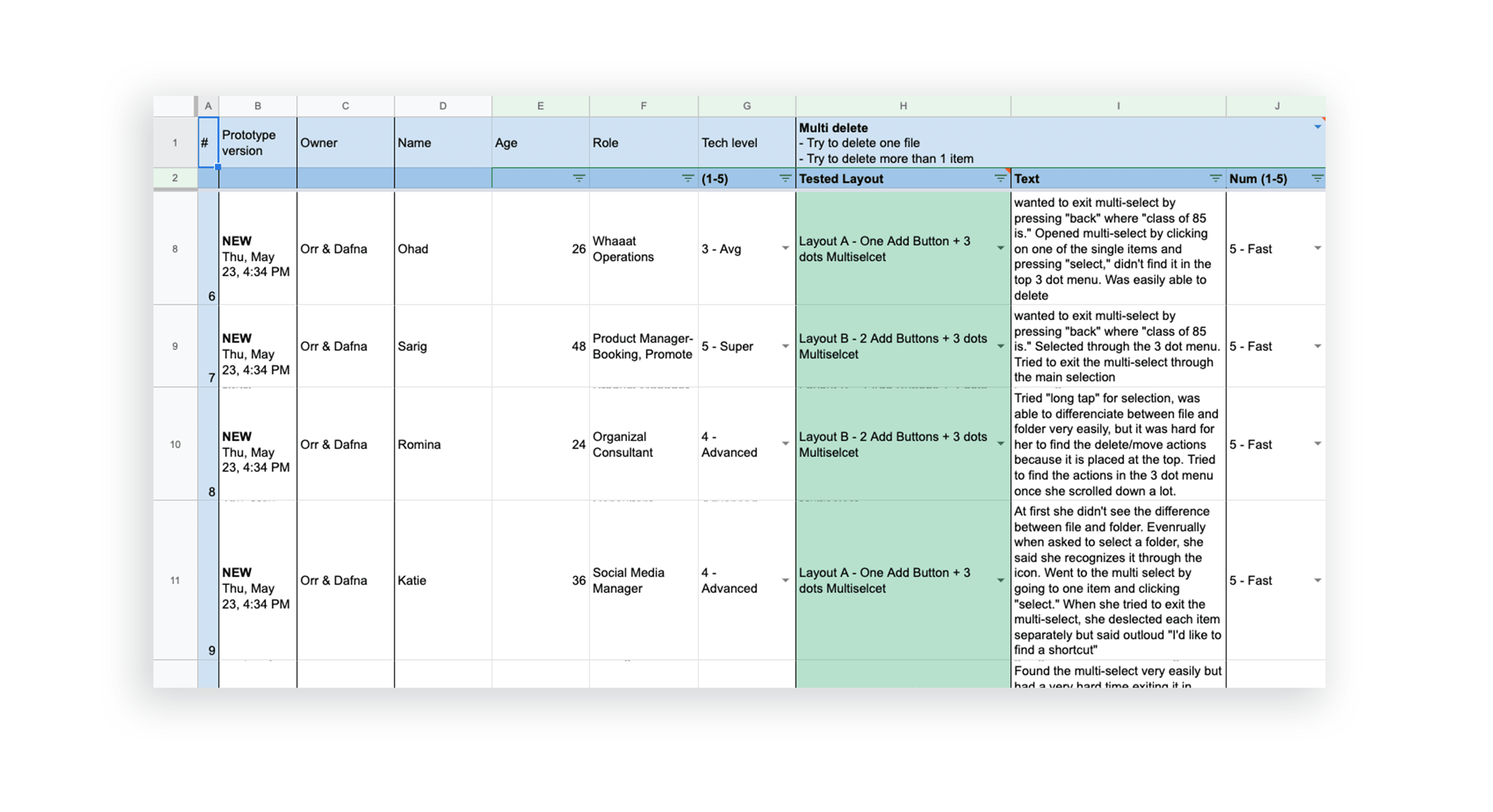
Mobile Design Prototypes
For mobile, we tested our certain behaviors like file selections and actions and folder creations using a prototype to achieve the best design. Results were documented above.
For mobile, we tested our certain behaviors like file selections and actions and folder creations using a prototype to achieve the best design. Results were documented above.
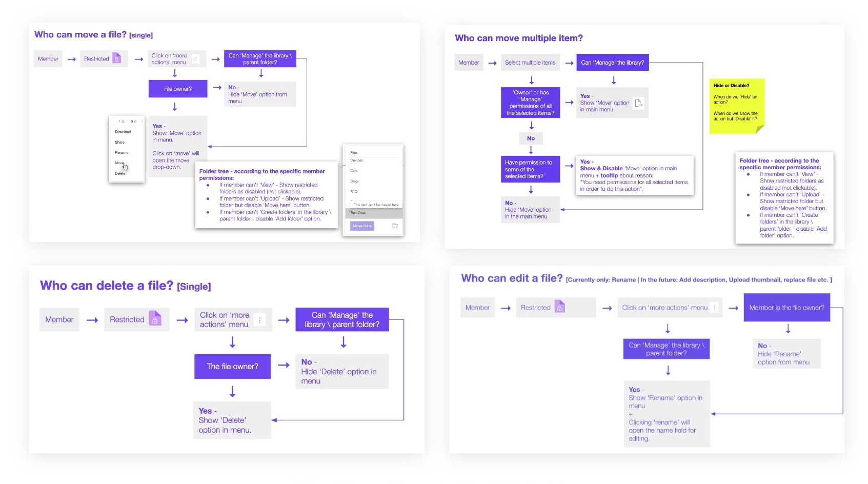
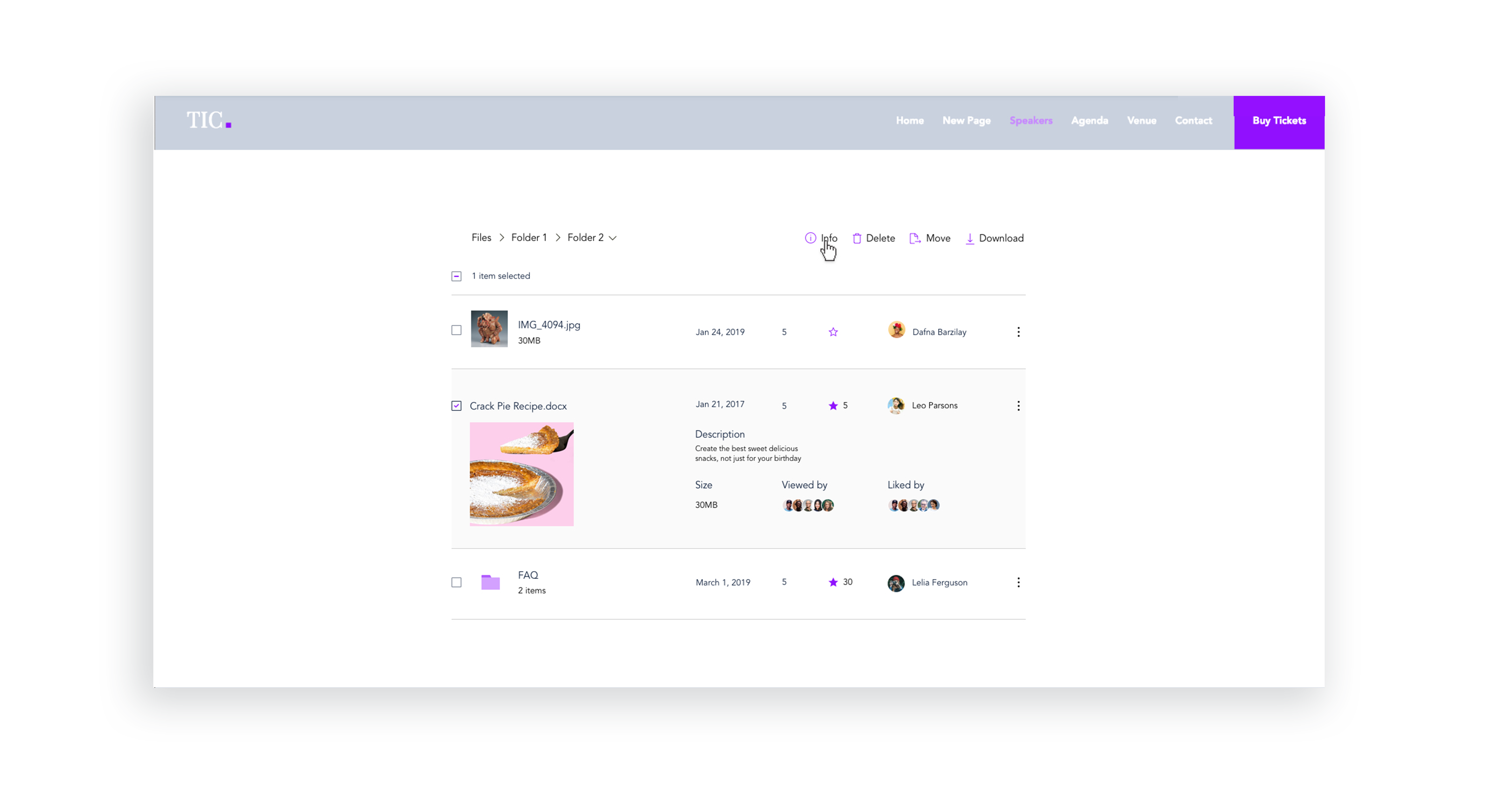
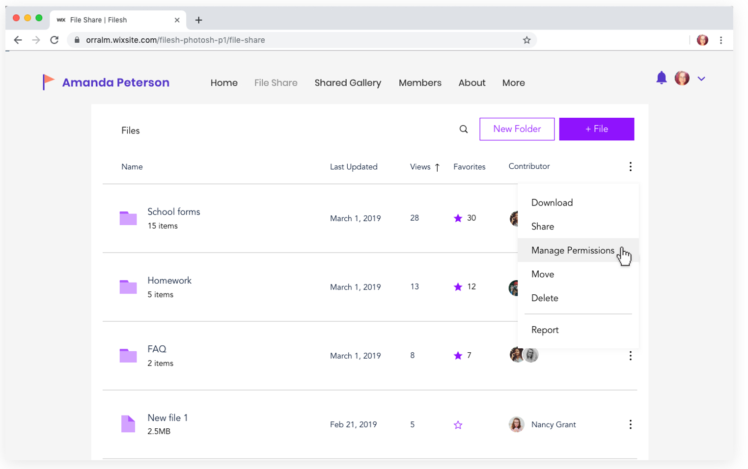
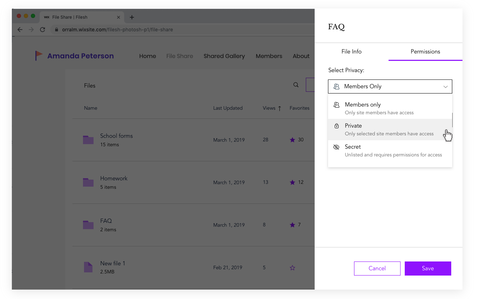
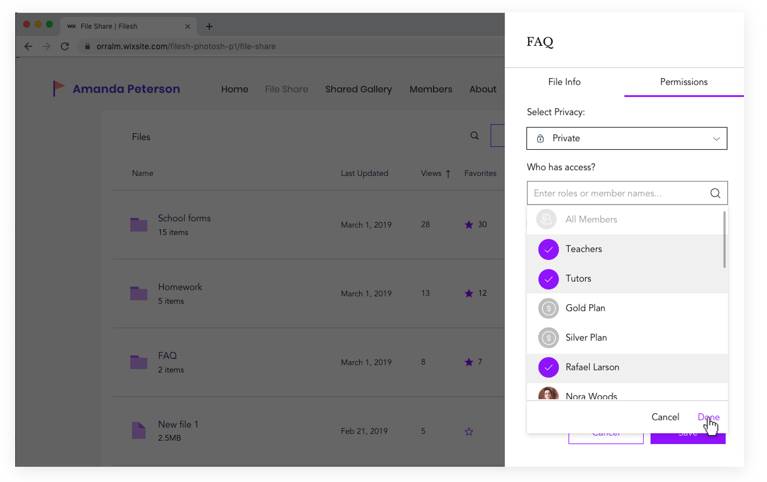
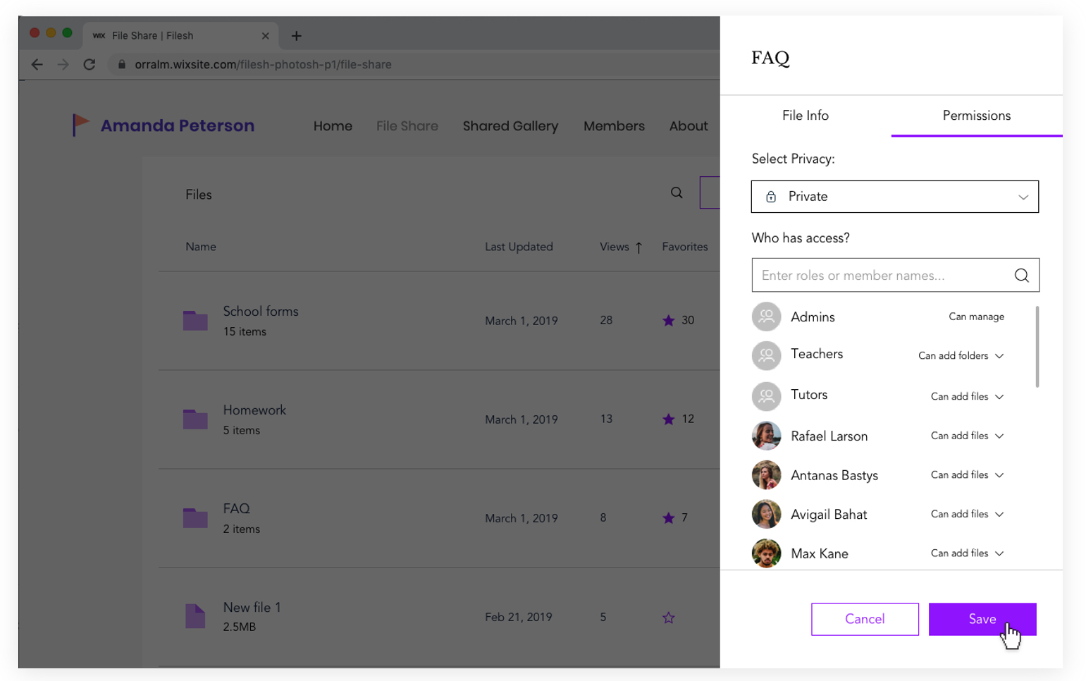
Privacy Permissions
In designing the folder permissions flow, I first had to map out the various user journeys for every possible action item that can be taken on a specific file or folder. Later, the full user flow was designed:
In designing the folder permissions flow, I first had to map out the various user journeys for every possible action item that can be taken on a specific file or folder. Later, the full user flow was designed:
In Summary
- I identified 3 key areas that needed user experience additions and refinement based on data collection, user conversations, and viewing users’ designed websites
- Design refinements were validated through prototype creation and user testing
- Folder and privacy permissions were designed and launched after finding it as the most requested feature
Product Design, UI
Stage Design System
Wix’s Stage Design System is a design system for all of Wix’s vertical apps such as Wix Stores, Wix Bookings, Blog, Forum, and more. Within the team, I researched and designed the components (based on atomic design methodology) that are placed “on stage” when users add such apps to create their website. These apps are eventually themed to the user’s website design but the system creates consistency in functionality and behavior.
Goals
- Create consistent behavior and functionality across all Wix’s vertical apps
- Maintain versality across all apps so that users have the freedom and flexibility to design websites according to their desired taste
- Increase design and development velocity
- Improve the standard of quality across all Wix on-stage apps, including meeting all accessibility standards
Process
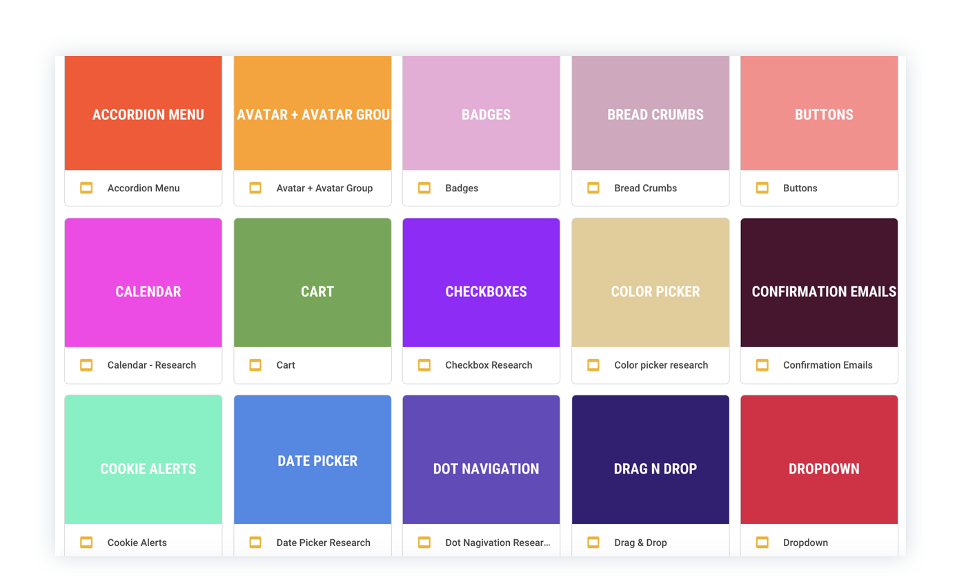
There are over 50 repeating components in over 14 On-Stage apps at Wix, so the first step was indexing and mapping out these components.
There are over 50 repeating components in over 14 On-Stage apps at Wix, so the first step was indexing and mapping out these components.
This is an example of a card component that looks and behaves differently in every product.
Research
For every UI components, a research deck containing different visual and functional refrences and reading materials was created.
For every UI components, a research deck containing different visual and functional refrences and reading materials was created.
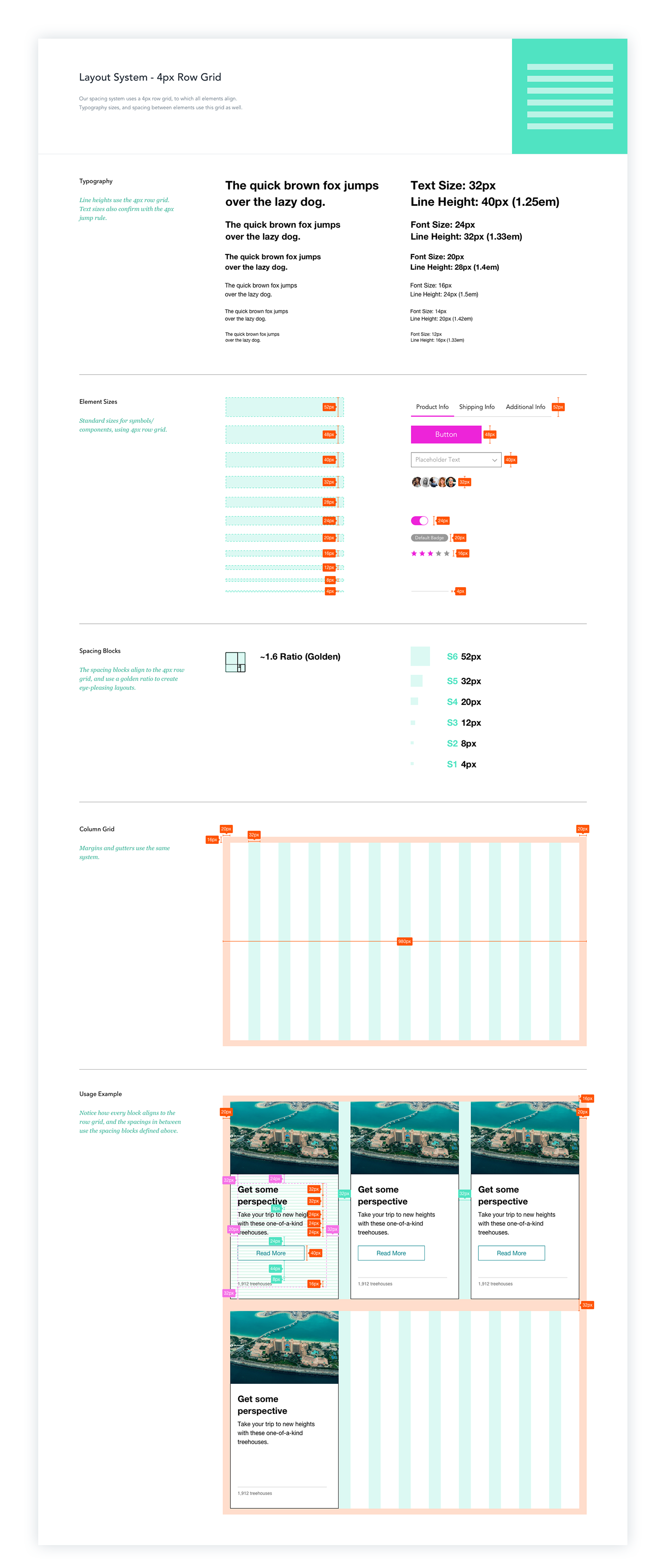
Grid, Layout, & Style Instructions
A style guide based on a 4px grid with recommendations for text sizes
A style guide based on a 4px grid with recommendations for text sizes
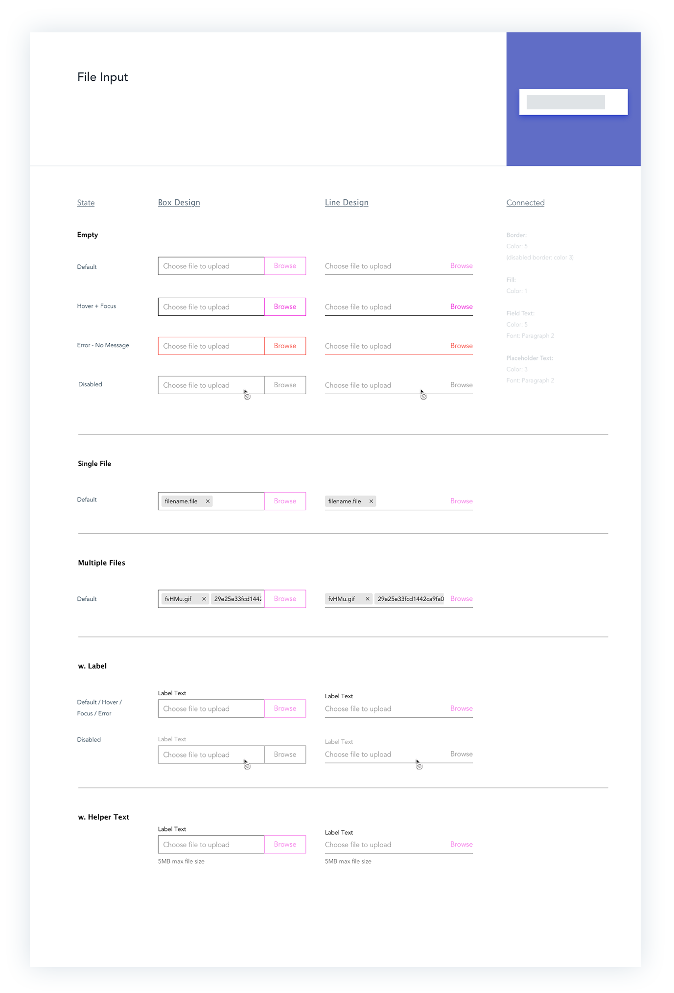
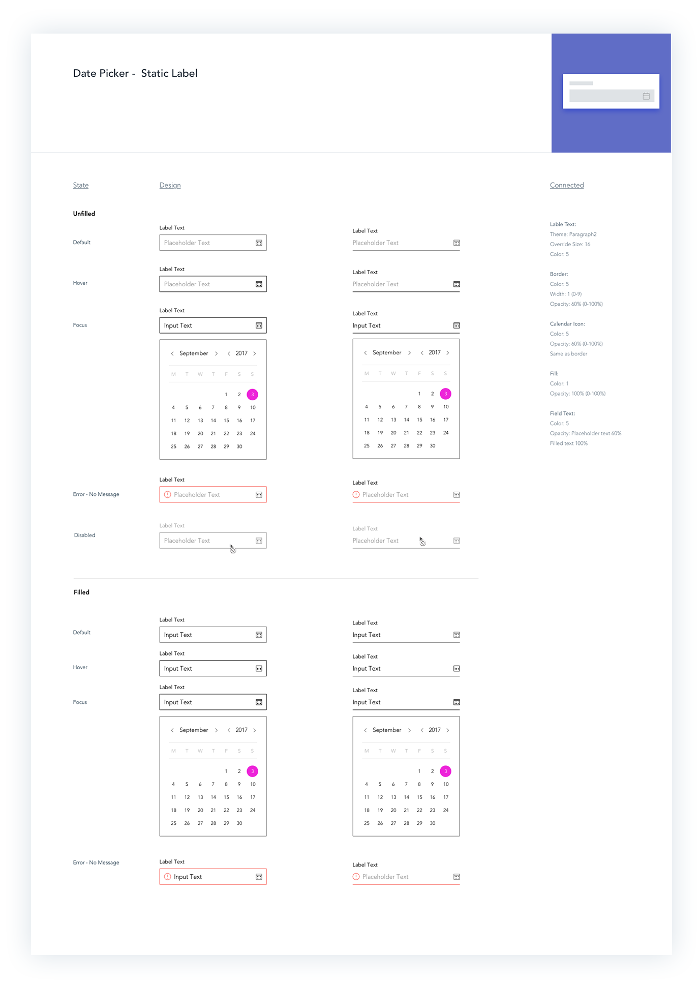
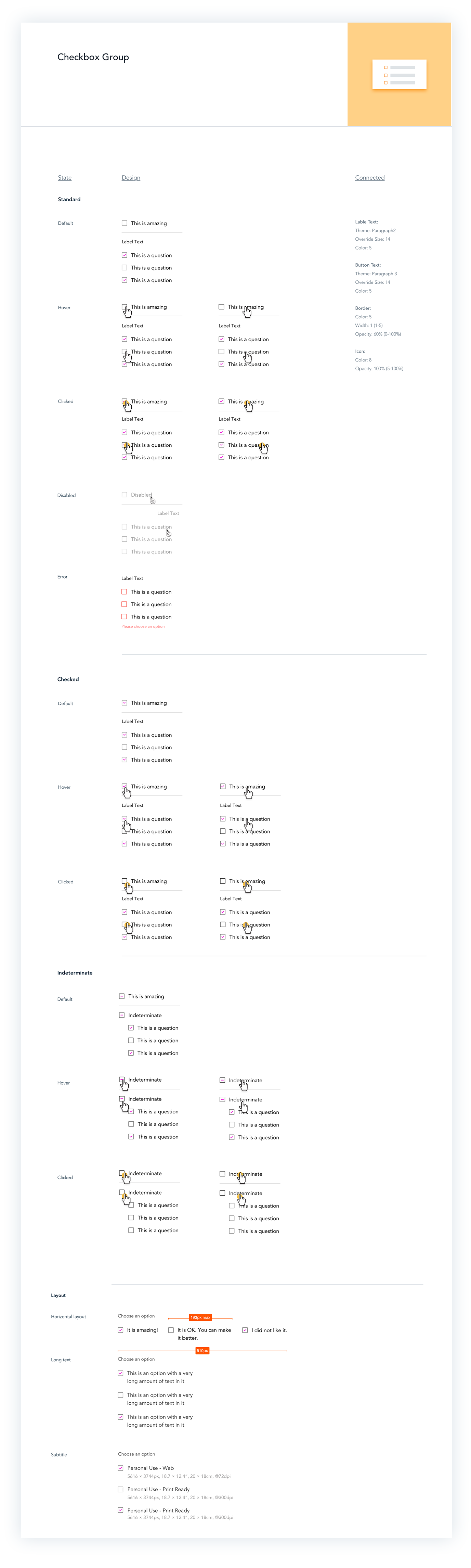
Components
A skech library of components with documentation was created for all Product Designers working on various on-stage apps. These components served as “skeletons” for themed UI that can later be stylized according to the website’s style guidelines.
A skech library of components with documentation was created for all Product Designers working on various on-stage apps. These components served as “skeletons” for themed UI that can later be stylized according to the website’s style guidelines.
Prototypes
Before releasing any component to the official developed library, quick protoypes on actual Wix templates were made to test the affect on the final web design.
Before releasing any component to the official developed library, quick protoypes on actual Wix templates were made to test the affect on the final web design.
Outcome
The result is a sketch library with documentation for the product designers working on the various on-stage apps as well as a detailed website with documentation displaying guidelines for both feature designers and developers.
The result is a sketch library with documentation for the product designers working on the various on-stage apps as well as a detailed website with documentation displaying guidelines for both feature designers and developers.
Implementation on the File Share App
Part of my work was also the actual implementation of the library on products such as the Wix File Share App - on on-stage app that allows website users to share files.
Part of my work was also the actual implementation of the library on products such as the Wix File Share App - on on-stage app that allows website users to share files.
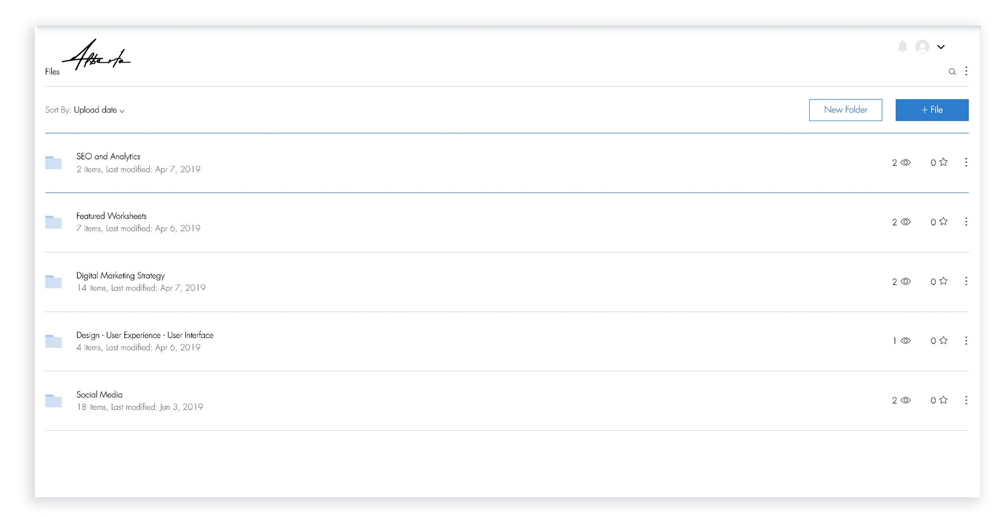
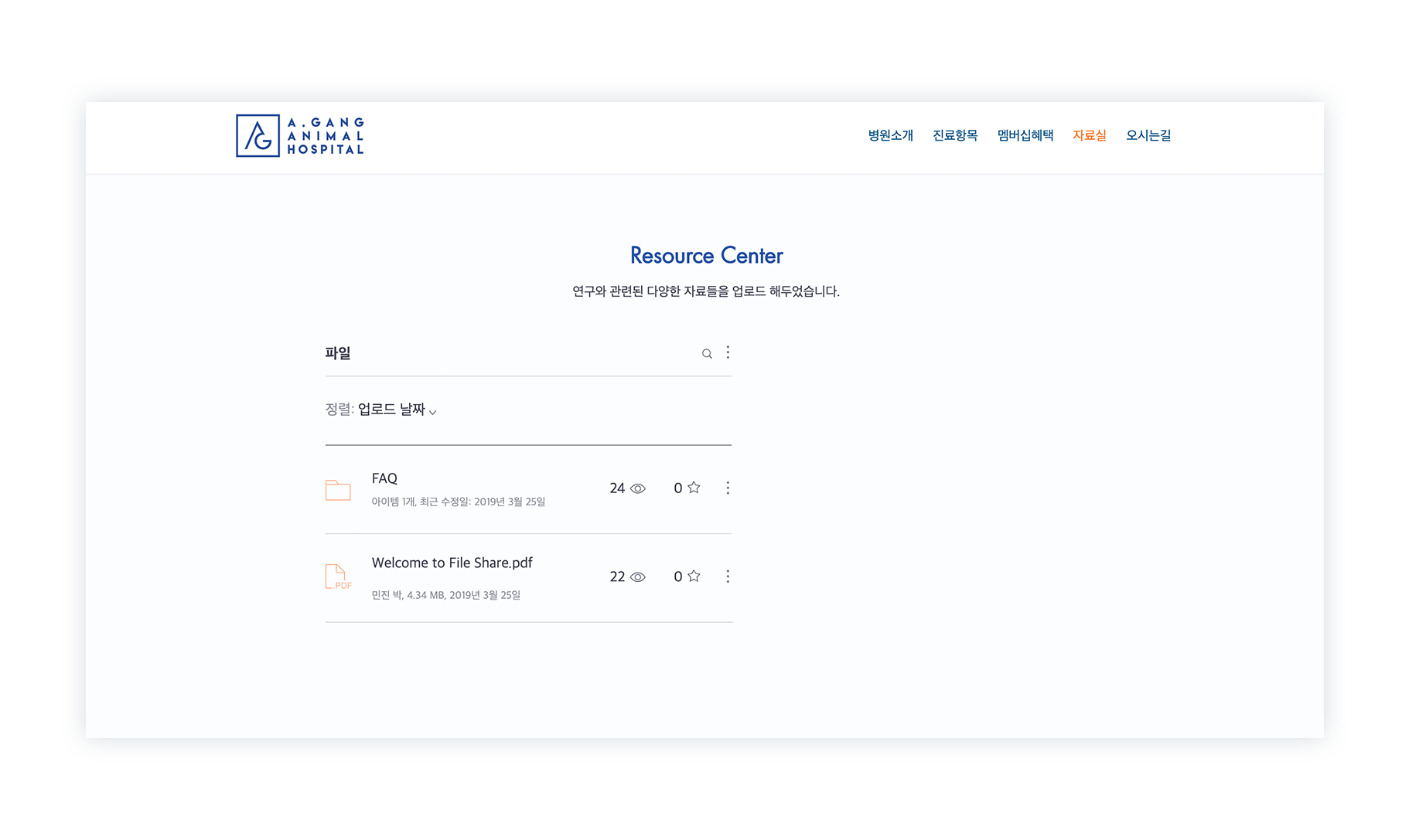
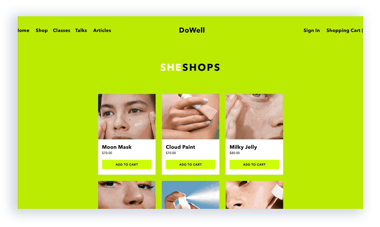
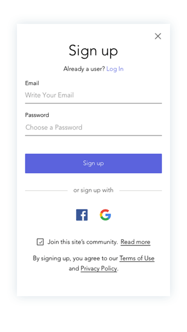
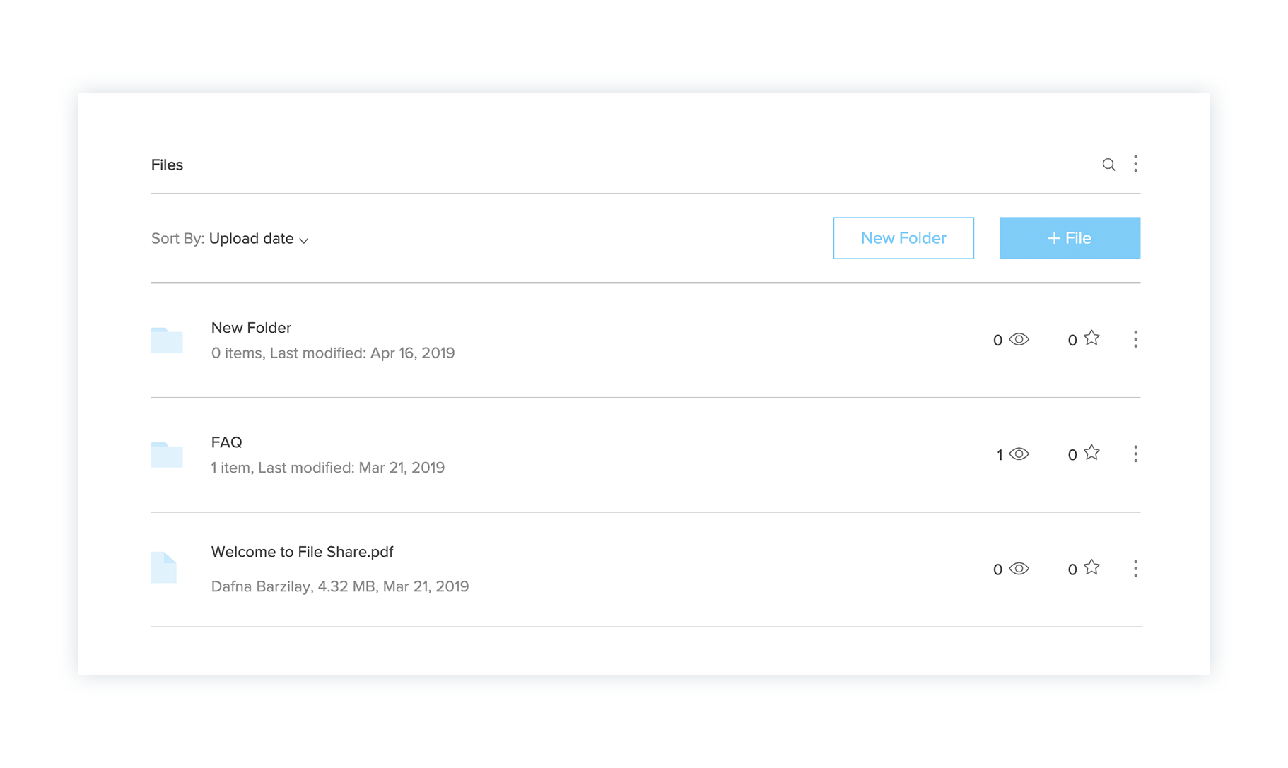
An example of a user’s website with the File Share App before the Stage Design System was applied
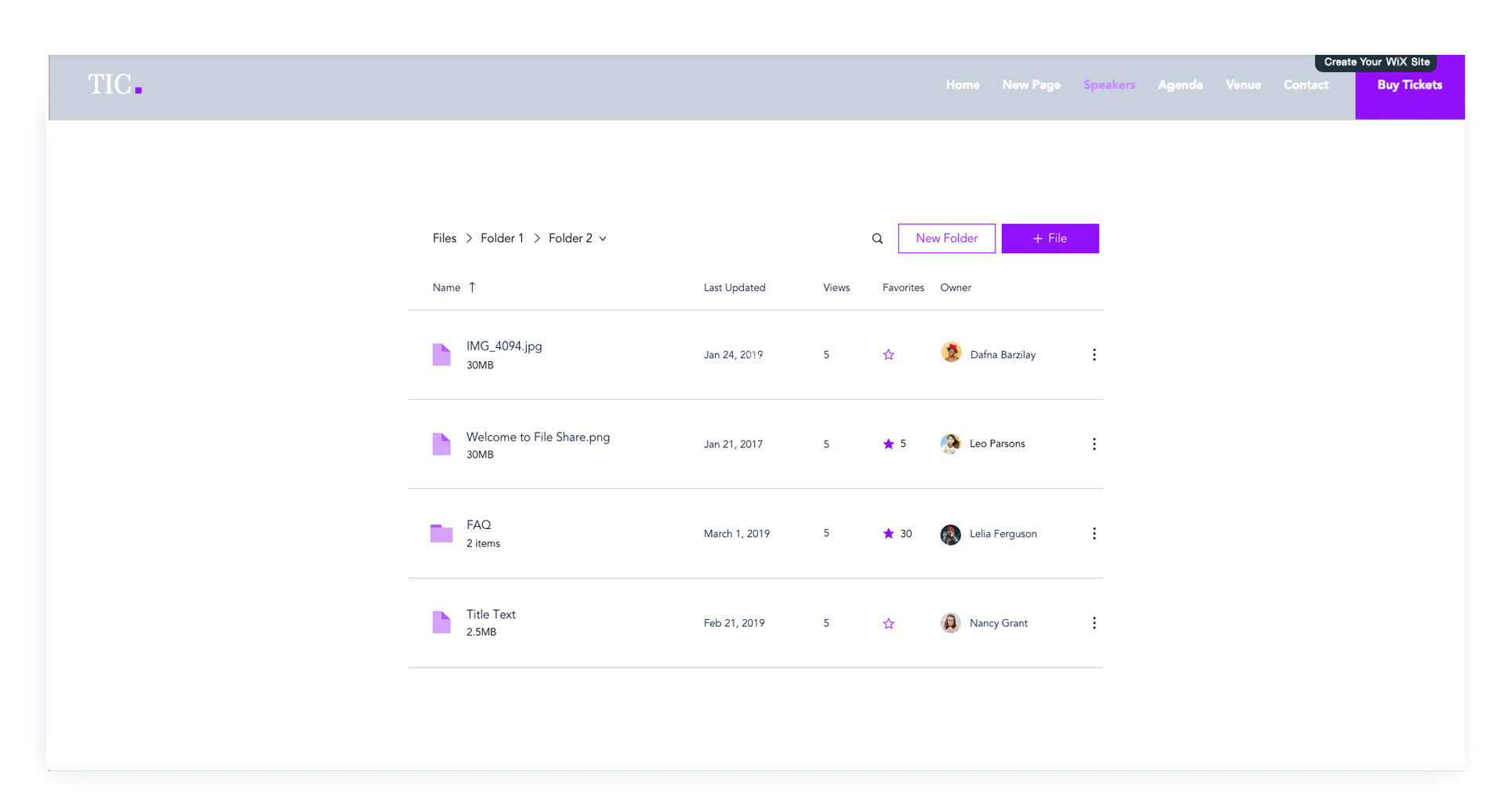
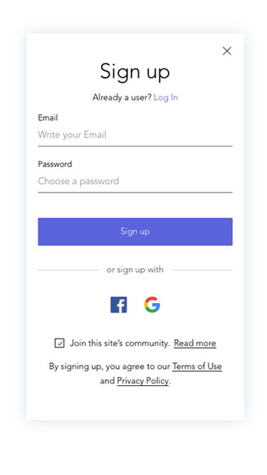
Redesign of the file share app with Stage Design System integration- cleaner layout, ease of use, with lots more flexibility
The Wix Arena
The Wix Arena is a marketplace for Wix Design Experts - freelance web designers - who use Wix as their main site building tool.
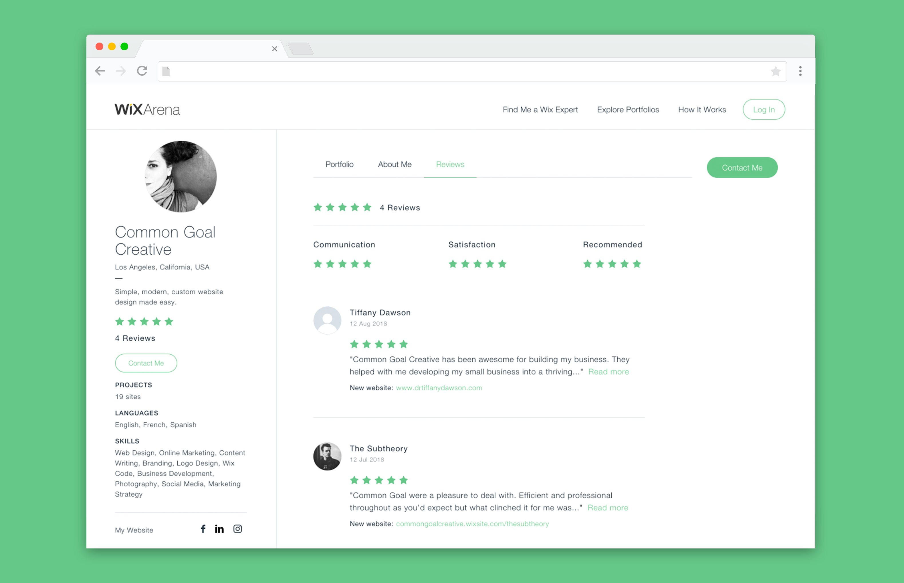
Goals:
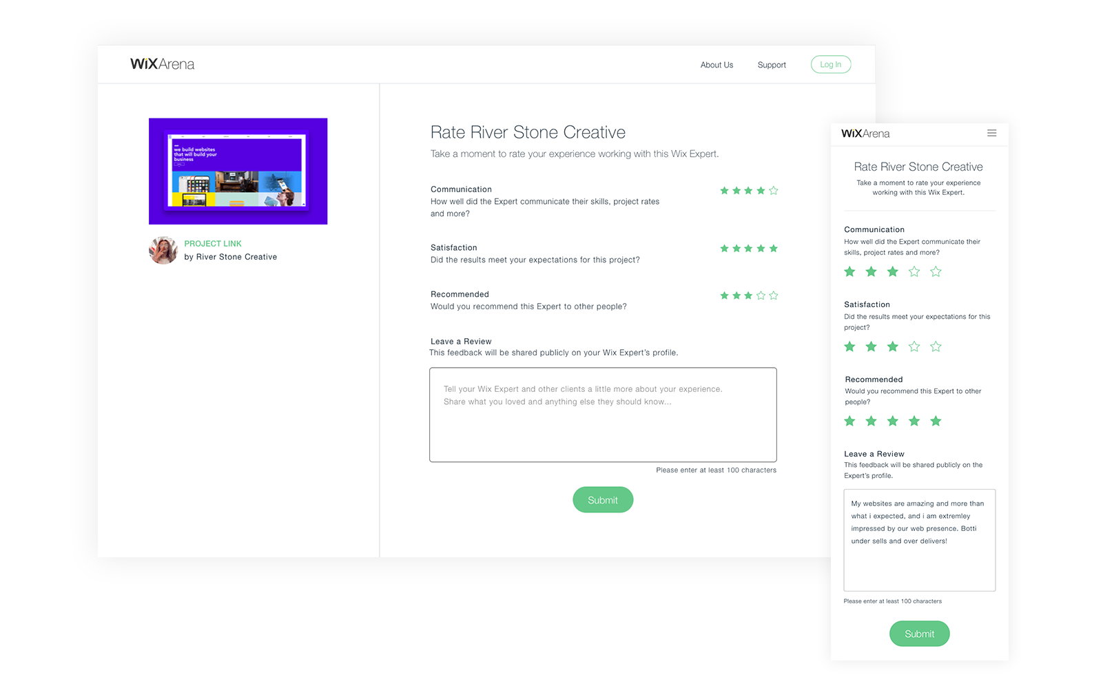
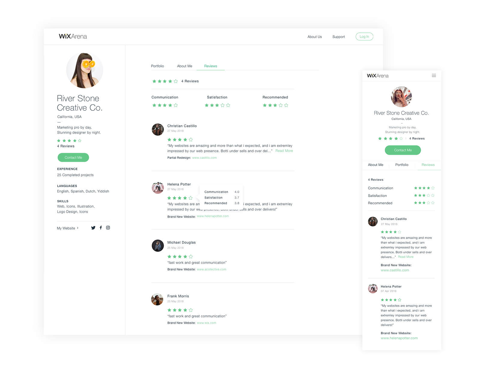
- Create a new ratings and reviews system for the Arena to allow clients to review their experiences with web designers.
- Allow clients a sleeker experience to search for the right web designers

User research
Our team found that the way in which clients search and find Wix experts is long and and complicated and therefore many of them abandon the process and prefer to look elsewhere for help in finding web design professionals.
Our team found that the way in which clients search and find Wix experts is long and and complicated and therefore many of them abandon the process and prefer to look elsewhere for help in finding web design professionals.

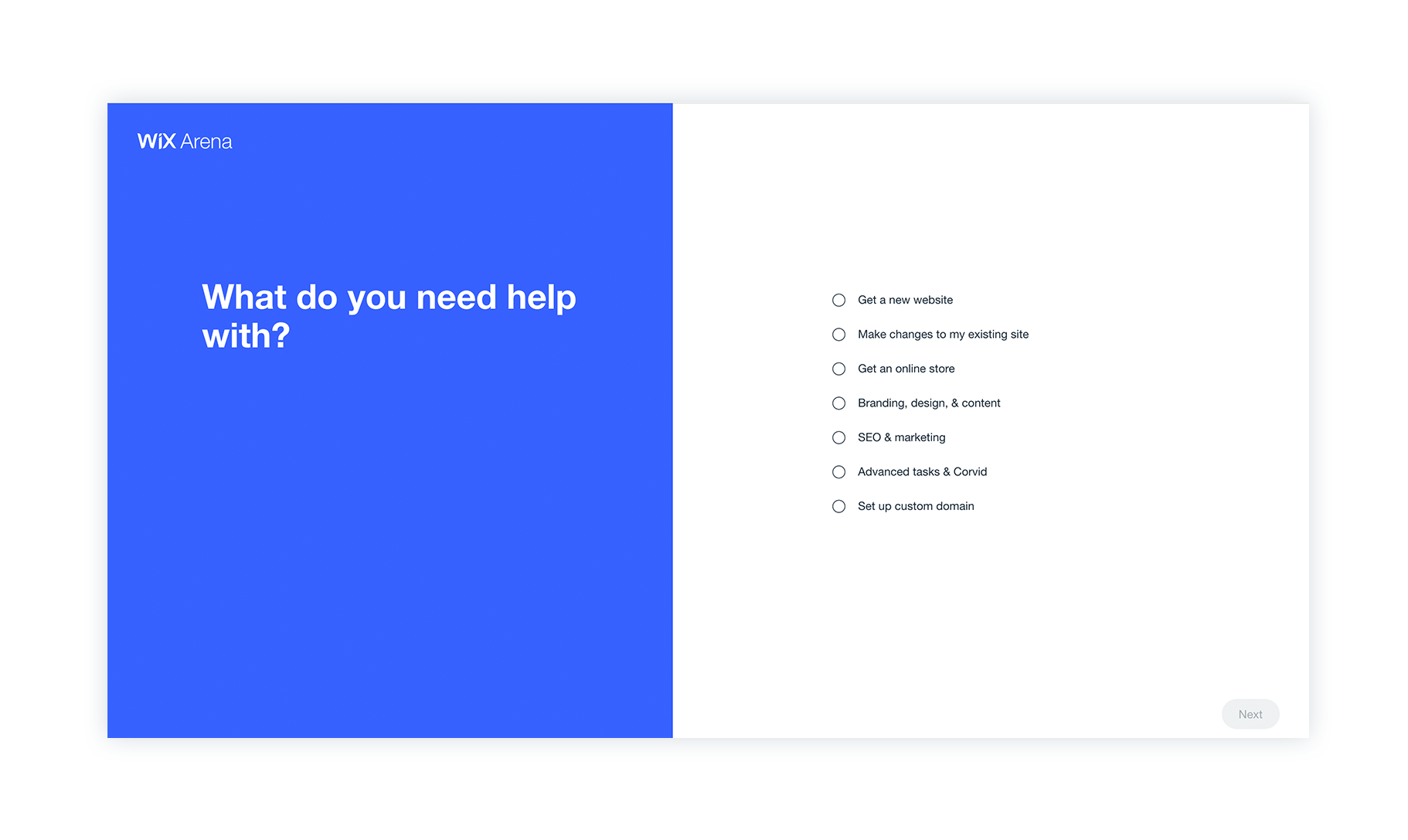

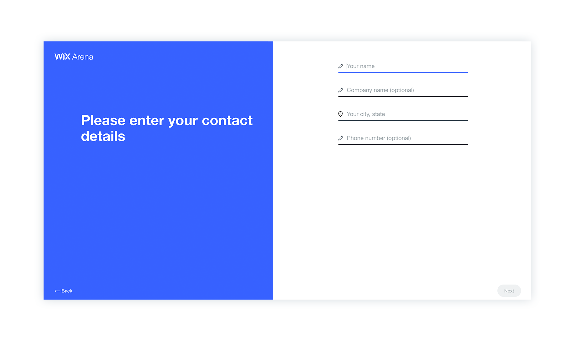
Solution:
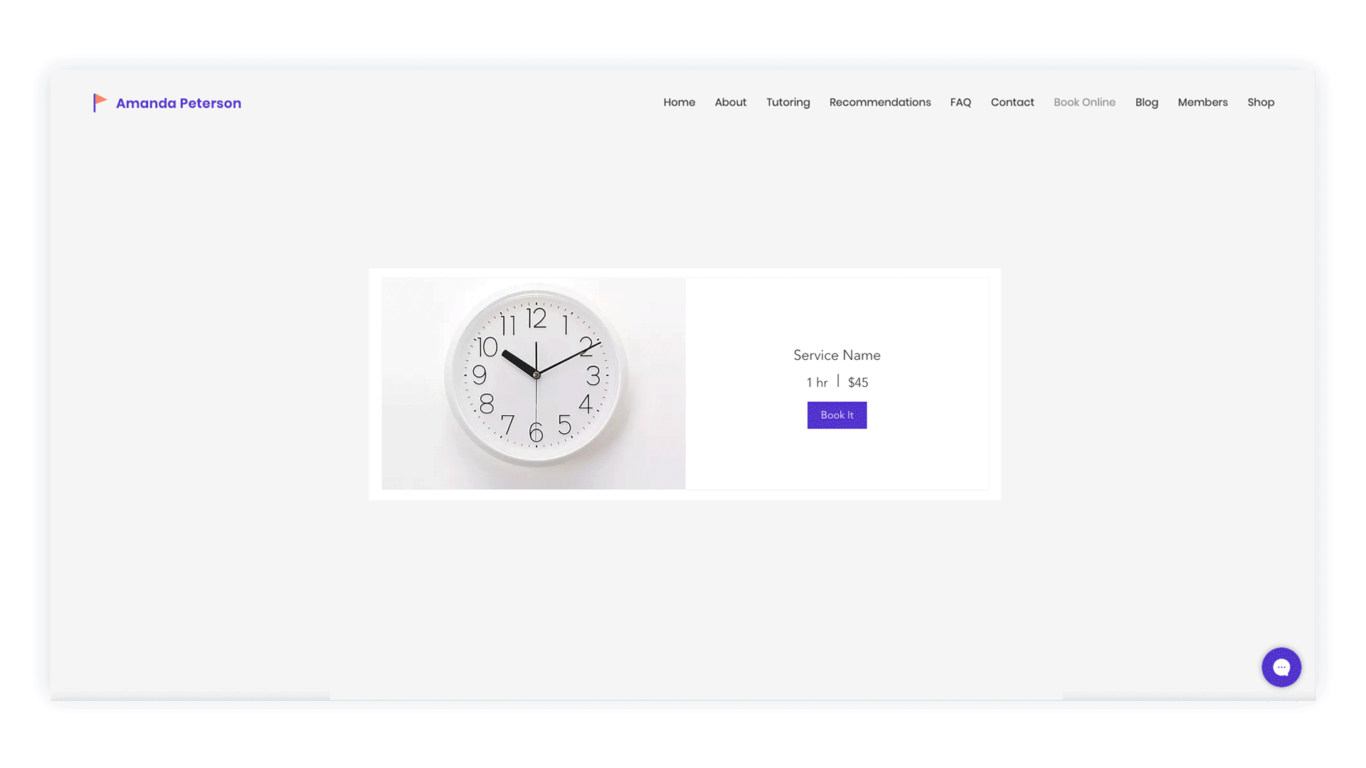
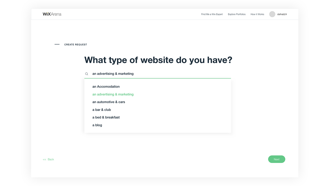
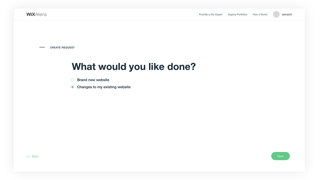
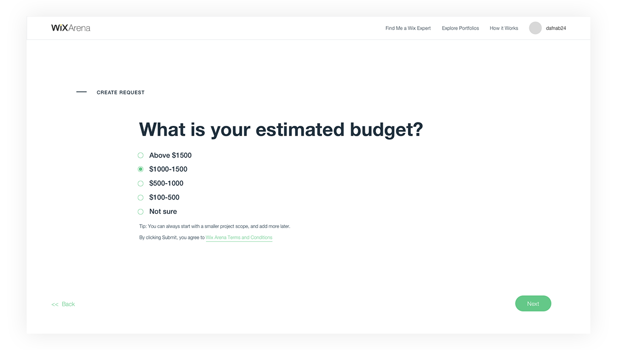
Synching with many product solutions across the Wix platform, a new designed form is split up into flows of wheter you’d like to create a new website or fix your existing one.
Synching with many product solutions across the Wix platform, a new designed form is split up into flows of wheter you’d like to create a new website or fix your existing one.